New Computer Fund

Thursday, April 26, 2012

'splain' My Detrending

There are a lot of sophisticated methods to manipulate time series to determine trends and remove trends for data series. I ain't all that sophisticated, some I am starting with baby steps. As the oceans temperature changes, the sea level should change somewhat. There are other factors involved in sea level change, but I wanted to see how well the UAH atmopsheric temperature data followed the sea level changes recorded by satellite altimetry. I downloaded the data for the NCDC site, but right now I can't find the exact link. Anywho, there is a much higher slope in the sea level change than in the mid troposphere temperature over the oceans as determined by the UAH MSU data. To better compare, I removed the slope in the seal level data, or simple removed the greater trend.
The first step was to remove the trend. In the above chart, the downloaded data is in blue. There are 665 data point, so I divided the rise by 665 and shifted each point by increasing the number of steps subtracted from the start. Nothing major, just removed the slope until the mean equaled the linear regression of the series.
After the series was detrended, I shifted the series and divided by common factor to get the series mean to equal the x-axis zero. This results in a scaled anomaly with not definite value. It is just scaled to provide a reasonable comparison of the detrended mean sea level orange and the UAH mid-troposphere oceans in blue which is in degrees C anomaly.
Since the Mean sea level data is recorded more often than the monthly UAH, I used a running mean of 5 mean sea level points to better compare the two without, hopefully, over smoothing the data. This post is just to briefly describe the detrending, if something really nifty turns up, I may get a little more detailed.

Saturday, April 21, 2012

So it is off a Touch, So What?

With billions of dollars invested and trillions at risk, how accurate should the climate data be? That question will cause many to proclaim I am a merchant of doubt. I don't make a living selling doubt but I do have a pretty good inventory. The chart above compares the gold standard surface station temperature data for the Southern Hemisphere with the state of the art satellite telemetry data for the same region. The University of Alabama, Huntsville data compiled by Dr. Roy Spencer is a bit controversial. Another group, Remote Sensing Systems (RSS) also has a satellite temperature product that is comparable. The UAH currently has a slightly higher trend over the period than the RSS group's. Doubters can make their own comparison. The trends in the above plot are 0.0107 degrees per year for the GISS surface station data and 0.0019 for the UAH data. So in one hundred years, if nothing changes, the Southern Hemisphere would be 100*0.0107=1.07 degrees warmer or 100*0.0019=0.19 degrees warmer. Now this is just the land mass temperatures for the bottom half of the planet which has more water than it does land mass. Most of us live in the Northern Hemisphere where we KNOW it is warmer.
Let's see, 100*0.0637=6.37, so if nothing changes, according to NASA GISS Northern Hemisphere land only surface temperatures it will be 6.37 degrees C warmer in 100 years. Pretty alarming huh? 100*0.092=0.92degrees C warmer in one hundred years based on the high dollar satellite data. The two sets disagree. They significantly disagree. That is not that unusual, what they are attempting to do is pretty damn hard, averaging the surface temperature of the whole planet by less than adequate means. So what's a guy to do? This guy compares something that is known to be happening to both. There are pretty good measurements of CO2 concentration from the Mauna Loa Observatory, increasing CO2 does have a radiant impact and that impact will have a relationship with temperature that is a natural log curve fit. Where on that curve is a question and that means that the magnitude of the impact is in question, but it will fit a natural log curve fairly well. You can prove that to yourself with some ink, and aquarium and your eyeballs if properly calibrated, a light meter is not. Start with clear water, add a half of drop of black ink at a time and measure the change in the light passing through the tank. The change will roughly match a natural log curve. Just for fun, use a rectangular tank and measure the light change from front to back and from side to side also. If you look up at the night sky, that is side to side, if you look up from a very high mountain top up, that is front to back. More on that later. Right now, here is my check.
The blue squiggly line in the middle of that plot is the estimate forcing due to CO2 increase since 1979 and it is compared to the global land only UAH satellite data. 100*0.0082=0.82 degrees C if nothing changes with the CO2 and 100*0.0080=.80 if nothing changes for the land temperature data. That is fairly good agreement. Note that the satellite data is all middle troposphere data. The data that should be warmer than the surface. Think about the aquarium for a second. Now assuming that nothing changes is not all that bright. Things do and will change but it is nice to have a somewhat reliable baseline to determine how much and what changed. Without getting into a graph, here is a quick check for the GISS data. The GISS data says the Southern Hemisphere is warming. The Antarctic sea ice is at record levels for the satellite era, which is about the only data we have on Antarctic sea ice. Would Antarctic sea ice be growing and at record levels if the Antarctic were warming? That Arctic sea ice is declining in summer. Is it declining in winter? There has been some decline in winter Arctic sea ice, but not a huge amount. Summer ice has either set or come close to setting a minimum record in 2007. This gives us a little logical check of GISS. Yes there has been warming in the Northern Hemisphere and it is unlikely there has been significant warming in the Southern Hemisphere. One thing is certain, there is definitely more seasonal change in the area and perhaps volume of sea ice globally since the start of the satellite era. Now a neat fun fact. Sea ice growth, drives the deep ocean currents. When salt water freezes, it losses some of the salt content so the actual ice formed is fresher than the water that formed it. That salt is lost to the unfroze water where it increases the density of that water which sinks deeper than the less dense water surrounding it. The more sea ice formed, the greater the volume of sinking, more dense, water. This water would be very close to the freezing point of fresh water, 0 C or 32 F. The deep oceans are not frozen, so the denser water settles into a thermal layer of approximately the same density beneath the surface. This sinking water must force some less dense water toward the surface. This creates a deep ocean current, falling cold dense water and rising less dense water. If the rate of sea ice production increases, the rate of the deep water cold current increases. That water is always at the same temperature as it is set by the freezing point of the water salinity. Now the harder part. With more rapid ice melt, the surface water would be fresher than normal, unless winds and currents mix the fresher melt water with the more saline ocean water. In the Antarctic, there is no indication of summer melt increase but evidence of increased winter formation, so there has been an increase in flow into the deep ocean current. In the Arctic, it really depends on which way and how strong the wind blows. So GISS gets a no go in the Antarctic and Southern Hemisphere and a grudging maybe in the Northern Hemisphere. So should we spend trillions of dollars because of a grudging maybe? I don't think so. There is still quite a bit of work to be done before we can predict climate.

Thursday, April 19, 2012

What the Flux!


hat is a busy chart comparing the Mauna Loa CO2 concentration change estimated forcing to the University of Alabama (UAH) Microwave Sounding Unit (MSU) middle tropospheric temperature data. The light blue line burried in the noise is the calculated forcing of CO2 based on the formula 5.35ln(Cf/co) were Co is 280 Parts Per Million PPM. Cf is the monthly average from the Mauna Loa observatory CO2 measurements. Since the UAH data is in anomalies, I converted the CO2 forcing estimate to Anomalies by subtracting the average of the period of the satellite data series.

Low and behold, the CO2 forcing is nearly a perfect fit of the UAH land temperature data series. Both the global and the ocean series are below the land series.

This chart is just the land data and the estimated CO2 forcing. Pretty close match. If you extend the regressions out to the year 2100, it is about 0.8 C greater than the start in 1979. Now here is a little bit of a shocker, CO2 is causing most of that warming. But why is it only a good match over land?

The average surface temperature of the Earth is often listed as 288K degrees with a outgoing energy flux of 390Wm-2. Average temperature, average flux right? The average temperature of the oceans, 70% of the global surface is about 294K degrees and the average temperature of the land area is about 273K degrees. The energy flux at 294K degrees is about 423.6Wm-2 and the flux at 273.15 is about 315.6Wm-2. .7*294+.3*273.15=287.7 and .7*423.6+.3*315.6=391.2 the temperature is a touch lower and the flux a touch higher. Small errors right?

If you add 3.7Wm-2 of forcing to a 273.13K surface it would increase to 273.9K. Add 3.7Wm-2 of forcing to a surface at 294K and it would increase the temperature to 294.6K, only 80% of the increase. If you estimate the increase in forcing based on an average of temperatures instead of an average of fluxes, you get a slightly high bias in your estimate. Then if you apply the slightly high estimate to an average of temperatures you would get a slightly low response. This is exactly what appears to have happened to the climate change projections.

This does not explain all of the discrepancies, but since the oceans appear to also have a negative water vapor feedback, it should explain a large percentage of the error.

What the Flux!T


hat is a busy chart comparing the Mauna Loa CO2 concentration change estimated forcing to the University of Alabama (UAH) Microwave Sounding Unit (MSU) middle tropospheric temperature data. The light blue line burried in the noise is the calculated forcing of CO2 based on the formula 5.35ln(Cf/co) were Co is 280 Parts Per Million PPM. Cf is the monthly average from the Mauna Loa observatory CO2 measurements. Since the UAH data is in anomalies, I converted the CO2 forcing estimate to Anomalies by subtracting the average of the period of the satellite data series.

Low and behold, the CO2 forcing is nearly a perfect fit of the UAH land temperature data series. Both the global and the ocean series are below the land series.

This chart is just the land data and the estimated CO2 forcing. Pretty close match. If you extend the regressions out to the year 2100, it is about 0.8 C greater than the start in 1979. Now here is a little bit of a shocker, CO2 is causing most of that warming. But why is it only a good match over land?

The average surface temperature of the Earth is often listed as 288K degrees with a outgoing energy flux of 390Wm-2. Average temperature, average flux right? The average temperature of the oceans, 70% of the global surface is about 294K degrees and the average temperature of the land area is about 273K degrees. The energy flux at 294K degrees is about 423.6Wm-2 and the flux at 273.15 is about 315.6Wm-2. .7*294+.3*273.15=287.7 and .7*423.6+.3*315.6=391.2 the temperature is a touch lower and the flux a touch higher. Small errors right?

If you add 3.7Wm-2 of forcing to a 273.13K surface it would increase to 273.9K. Add 3.7Wm-2 of forcing to a surface at 294K and it would increase the temperature to 294.6K, only 80% of the increase. If you estimate the increase in forcing based on an average of temperatures instead of an average of fluxes, you get a slightly high bias in your estimate. Then if you apply the slightly high estimate to an average of temperatures you would get a slightly low response. This is exactly what appears to have happened to the climate change projections.

This does not explain all of the discrepancies, but since the oceans appear to also have a negative water vapor feedback, it should explain a large percentage of the error.

Sunday, April 15, 2012

What's a Watt?

A Watt is a unit of energy flow or power named after James Watt, the steam engine guy. There are lots of energy terms. According to Wikipedia, a Watt is defined as a Joule/second which is a measure of energy conversion or transfer. Since it is a flow thingy, you have to know the area it is flowing through and how long it is flowing. The units for the power then is in Watts per meter squared per some period of time. Since it is defined as a Joule per second, there are 60 seconds in a minute and 60 minutes in an hour, there are 3600 Joule/seconds in a Watt hour. A kilowatt hour would be 3,600,000 Joule seconds.

So should I say that there is only 0.1 Joules/second-meter squared of energy flow, that would be tiny. If that flow was through the surface of the Earth with an area of 510,000,000 kilometers squared which is 510,000,000,000,000 meters squared, it would still be small to most folks thinking. At 0.1 Wm-2, that would be 5.1 x 10^13 Joules per second or Watt-seconds. Since there are 3.6 x 10^6 Joules per kilowatt-hour, that would only be 1.42 x 10^7 Kilowatts per hour. That is about 14.2 GigaWatts per hour. Big number, but still small to most folks.

In order for those folks to consider it significant, it takes more time, say 40 years. There are 60x60x24x365.25x40 equals 1.26 x 10^9 seconds in 40 years. I have lived more that that many seconds, so from experience I can tell you that is not a very long time. Now with 1.26 x 10^9 seconds and 5.1 x 10^13 Joules per second you end up with 6.44 x 10^22 Joules. That seems like a lot of Joules. Still that is not much to some folks. Those folks think that 22 x 10^22 is a lot of Joules. Well it is a little over three times as much as the not so much 6.44 x 10^22 Joules. If you convert it to kilowatt hours, the number is even smaller. It is only like running a 14.2 gigawatt-hour power plant 24/7/365 for 40 years. Nothing right?

If the surface of the Earth was to cool from 288K to 287.8K, that is not much either. That would only be 1Wm-2 less energy radiating from the surface if the surface were a true black body. That is ten times as much as 0.1Wm-2, so that would be like running the 14.2 gigawatt-hour power plant for only four years, 24/7/365.

Well, the average surfacetemperature of the World's oceans is more than 288K degrees. They are closer to 294.25 K degrees. If their temperature dropped to 294.225, a 0.025 K degree drop, that would be like 0.1Wm-2 less energy, which must also be insignificant to most.

More AQUA StuffA


AQUA satellite data is not a particularly long set and with the gaps it does have issues. The chart above AQUA ocean surface temperature for the length of the series is adjust to anomalies showing seasonal variation. When the sun is in the southern hemisphere, the ocean warms more and it cools more in the southern winter. Nothing shocking about that. There appears to be a slight downward trend, but not much. To compare years, I averaged each year of the series produce an "average" season, short record, not much significance in that, just something to look at.


As you can see in the first four years, "average" is not something we can expect very often. Each year has significant variations. I did at a mean value line so that general warming or cooling for the whole year versus "average" can be seen. 2006, is the year before the great Arctic Ice Melt. It was warmer than previous years, but not by much.


Following the great ice melt, things keep on keeping on. The temperature variations increased likely to the ENSO, but the range of change is within +.06 and -0.1 degrees. I may make more comparisons of other channels with the "averages". What would be interesting is a comparison with cloud fraction.

Thursday, April 12, 2012

Building a Better Model - Data Issues

I doesn't matter how elaborate a model you build of the atmosphere, if you can't verify it with data it won't fly. When you have so much data with so many conflicts and you are looking for extremely small changes, you may need a model just to determine which data is meaningful and which leads down a rabbit hole. So this is a first attempt to generate a little different twist on the satellite data to help isolate issues with the different data sets.

The Aqua data is short and has gaps. The data started in 2002 and is current, but the channel 4 data bit the dust and there are gaps in the other channels. The data is in degrees Kelvin for different atmospheric pressure levels. Channels adjacent to each other likely have some error due to proximity, so leap frogging one or more channels should reduce that error. This is a chart for channel 5 the 600millibar layers (approximately 4.3 kilometer altitude) and the 50 millibar layer, (approximately 50 millibar).


On the chart, the blue curve is an approximation of the flux imbalance between the two layers. By converting the temperature value of each layer into perfect black body flux values using the Stefan-Boltzmann relationship, the subtracting the channel 5 flux equivalent from the channel 10 flux equivalent. This was then modified to an anomaly by subtracting the average of the entire range from the daily values. Where there are gaps in either data set, those days are left blank and skipped in the plot. The orange curve is an approximation of the emissivity for the ch. 5 600 mb layer to the ch. 10 50 mb layer. This plot uses the right y axis scale. The calculation for the emissivity is flux equivalent of the ch 10 data divided by the flux equivalent of the ch. 5 data.

The emissivity of a perfect gray body should approach 0.5 unless my estimates are completely screwed up. Deviations from 0.5 should indicate that energy is converted into work, passing through the medium without interaction, being transported by other than radiant means, or something is wrong.

The limited data indicates that the emissivity between layers is above 0.5 and slowly approaching a value closer to 0.5 and that there is a fairly large seasonal swing in the flux difference between layers with than difference reducing with time. Warmer years have higher positive values. with the average reducing, that would indicate that at least for the short term that there will be some reduction in the average temperature of the 600mb layer. The fit of the two curves is very close since they are based on the same flux relationship. There is some interesting difference in the peak and valley correlation. At the peak, both the estimated imbalance and the emissivity plateau at the same relative locations. In the valleys, emissivity decrease reduces faster than the estimated flux imbalance. This may indicate that convective cooling is taking a larger role relative to radiant cooling at or below the tropopause. The valley difference may indicate a return to radiant control of cooling in the media between the two layers.

The change in the estimated emissivity is most interesting. Changes in the minimum local emissivity due to mixed phase clouds, primarily in the Arctic, cause considerable uncertainty in the energy budget estimates. With more complete data, (using surface to 150mb and other AQUA channels) plus a longer data series, better estimates of the impact of minimum local emissivity variation may be determined.

The data used was taken from the Discover AQUA site and transferred to a spreadsheet. There may be errors in the charts due to transcription errors or brain farts. The purpose of the chart is just to show a potential application of the AQUA data for atmospheric physics hobbyists.


This chart compares the approximate emissivities of the 600mb channel 5 to the higher channels up to channel 11 at 25 kilometers and 25 millibar. If Channel 4, the lowest troposphere level were available it would have the highest emissivity value. These are relative emissivities which could easily be called transmittance. Each higher layer transmits less of the emission from the channel 5 layer. So if channel 5 emits 300Wm-2 and channel 10 emits 100Wm-2, 100/300 would be .33 or the amount of channel 5 energy emitted by channel 10. Two thirds of the channel 5 energy may be emitted to space. Of course, all the energy from the higher layer need not originate at the channel 5 layer, portions could be due to short wave absorption in the atmosphere above channel 5. However, the channel 5 layer is moist an likely close to the maximum radiant layer. There is only a short section of the channel 4 layer, but I will dig that out for a comparison.

Sunday, April 1, 2012

Agricultural Impact on Climate, Real and not so Real

More than one experimenter has been fooled by his own data. The world's energy problems were solve by a team of researchers at the University of Utah when they discover cold fusion. That was until they found out that their data had fooled them. Measuring temperature can be tricky.

With a significant percentage of the surface of the Earth altered by mankind to produce food, shelter and ease of transportation, that should have an impact on climate. After all, CO2 is supposed to only make a 1 percent change, a 10 percent change or better in land use should have and impact greater than CO2. Some scientist agree than land use is responsible for most of the warming, some disagree. They are all good scientists, why would there be any disagreement?

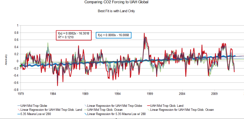
Because numbers lie.

Anyone that has ever attempted to garden knows the value of mulch. It looks great when you first install it, it slows down the growth of weeds so it looks better longer, it retains soil moisture so you don't have to water as often, and it regulates the soil temperature. The mulch can be black, that nifty red looking stuff, honey colored hay, various shades of brown or even some goofy custom color to match your house color. No matter what color, it still does the job.

Forests tend to prefer the natural color mulch which is darker brown to nearly black. Most farmer don't use mulch. So if farmers remove trees and brush to build farmland, the natural mulch is turned into the soil. The temperature over the farmland will be warmer than the temperature over the forest floor and not just because of the shade from the trees.

Mulch, despite the chosen color is an insulator. The air trapped in the loose mulch warms before the soil and convects heat away from the dirt. Dirt is an insulator, but not as good as mulch. More heat is absorbed by the deeper soil uncovered by mulch than that covered. That is a good thing for seed germination,but it tends to increase evaporation of water from the soil. The more heat that is absorbed, the more watering that is required. Remember, that is another reason gardeners like mulch.

So soil temperature will be higher in the day time without mulch. The soil will release more of that heat at night because mulch is a better insulator than soil. This has a real and a not so real impact on the average global temperature.

The real part is that the soil absorbs more energy which is measured as increased temperature. The unreal part, is that the flow of energy and reflection of solar energy impacts the temperature measurements more than the air that is attempted to be measured.

Great pains are taken to make sure that the housings of the surface station temperature measurements are consistently white, so that they absorb a uniform amount of direct solar energy. Then that very scientifically designed instrument is mounted on a pole. In most areas, that pole is now galvanized metal. In some areas it may be pressure treated lumber. It others it may be a neat bracket. The choice makes a difference in the measured temperature.

Take a few of the new digital weather stations with the neat white beehive vented housing. Mount one on a black metal pole, one on a natural wood pole and one on a wooden pole painted white. Would there be any difference in the temperature measured? Now set each a white sheet under each, would there be a temperature difference?

So you see, hopefully, part of the issues with direct measurement of surface temperature.

What generally defines the energy absorption of the surface is the albedo or the reflectivity of the surface. What defines the impact of the albedo is the retained energy. A black surface that does not retain energy has little impact on climate by a great deal of impact on temperature measurement. This is the issue with determining how much impact agriculture has had on climate. The albedo change says not much. The difference in retained energy says a whole bunch. So a more accurate measurement of climate change would be soil temperature below the surface. That is not on the list of priorities, so the next best measurements are sea surface temperature and ocean heat content.

The moral of this story is take all measurements with a grain of salt. Everything measured needs verification if it is to be relied upon.