With billions of dollars invested and trillions at risk, how accurate should the climate data be? That question will cause many to proclaim I am a merchant of doubt. I don't make a living selling doubt but I do have a pretty good inventory.
The chart above compares the gold standard surface station temperature data for the Southern Hemisphere with the state of the art satellite telemetry data for the same region. The University of Alabama, Huntsville data compiled by Dr. Roy Spencer is a bit controversial. Another group, Remote Sensing Systems (RSS) also has a satellite temperature product that is comparable. The UAH currently has a slightly higher trend over the period than the RSS group's. Doubters can make their own comparison. The trends in the above plot are 0.0107 degrees per year for the GISS surface station data and 0.0019 for the UAH data. So in one hundred years, if nothing changes, the Southern Hemisphere would be 100*0.0107=1.07 degrees warmer or 100*0.0019=0.19 degrees warmer. Now this is just the land mass temperatures for the bottom half of the planet which has more water than it does land mass. Most of us live in the Northern Hemisphere where we KNOW it is warmer.

Let's see, 100*0.0637=6.37, so if nothing changes, according to NASA GISS Northern Hemisphere land only surface temperatures it will be 6.37 degrees C warmer in 100 years. Pretty alarming huh? 100*0.092=0.92degrees C warmer in one hundred years based on the high dollar satellite data. The two sets disagree. They significantly disagree. That is not that unusual, what they are attempting to do is pretty damn hard, averaging the surface temperature of the whole planet by less than adequate means.
So what's a guy to do? This guy compares something that is known to be happening to both. There are pretty good measurements of CO2 concentration from the Mauna Loa Observatory, increasing CO2 does have a radiant impact and that impact will have a relationship with temperature that is a natural log curve fit. Where on that curve is a question and that means that the magnitude of the impact is in question, but it will fit a natural log curve fairly well. You can prove that to yourself with some ink, and aquarium and your eyeballs if properly calibrated, a light meter is not. Start with clear water, add a half of drop of black ink at a time and measure the change in the light passing through the tank. The change will roughly match a natural log curve. Just for fun, use a rectangular tank and measure the light change from front to back and from side to side also. If you look up at the night sky, that is side to side, if you look up from a very high mountain top up, that is front to back. More on that later. Right now, here is my check.

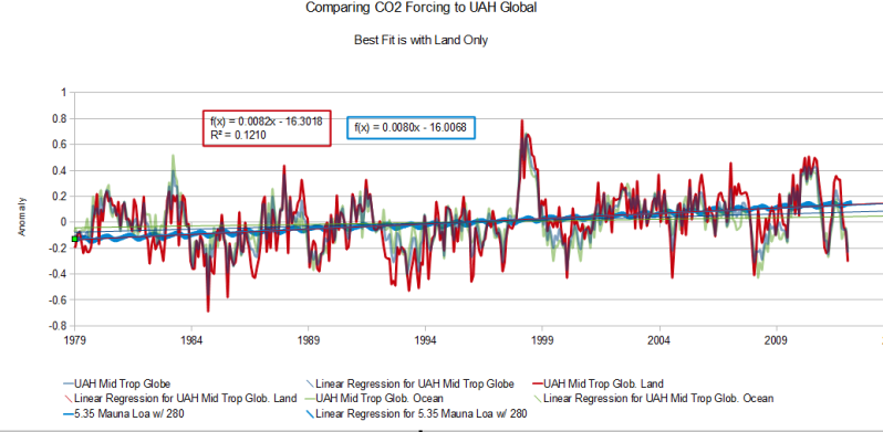
The blue squiggly line in the middle of that plot is the estimate forcing due to CO2 increase since 1979 and it is compared to the global land only UAH satellite data. 100*0.0082=0.82 degrees C if nothing changes with the CO2 and 100*0.0080=.80 if nothing changes for the land temperature data. That is fairly good agreement. Note that the satellite data is all middle troposphere data. The data that should be warmer than the surface. Think about the aquarium for a second.
Now assuming that nothing changes is not all that bright. Things do and will change but it is nice to have a somewhat reliable baseline to determine how much and what changed.
Without getting into a graph, here is a quick check for the GISS data. The GISS data says the Southern Hemisphere is warming. The Antarctic sea ice is at record levels for the satellite era, which is about the only data we have on Antarctic sea ice. Would Antarctic sea ice be growing and at record levels if the Antarctic were warming? That Arctic sea ice is declining in summer. Is it declining in winter? There has been some decline in winter Arctic sea ice, but not a huge amount. Summer ice has either set or come close to setting a minimum record in 2007. This gives us a little logical check of GISS. Yes there has been warming in the Northern Hemisphere and it is unlikely there has been significant warming in the Southern Hemisphere. One thing is certain, there is definitely more seasonal change in the area and perhaps volume of sea ice globally since the start of the satellite era. Now a neat fun fact. Sea ice growth, drives the deep ocean currents.
When salt water freezes, it losses some of the salt content so the actual ice formed is fresher than the water that formed it. That salt is lost to the unfroze water where it increases the density of that water which sinks deeper than the less dense water surrounding it. The more sea ice formed, the greater the volume of sinking, more dense, water. This water would be very close to the freezing point of fresh water, 0 C or 32 F. The deep oceans are not frozen, so the denser water settles into a thermal layer of approximately the same density beneath the surface. This sinking water must force some less dense water toward the surface. This creates a deep ocean current, falling cold dense water and rising less dense water. If the rate of sea ice production increases, the rate of the deep water cold current increases. That water is always at the same temperature as it is set by the freezing point of the water salinity. Now the harder part. With more rapid ice melt, the surface water would be fresher than normal, unless winds and currents mix the fresher melt water with the more saline ocean water. In the Antarctic, there is no indication of summer melt increase but evidence of increased winter formation, so there has been an increase in flow into the deep ocean current. In the Arctic, it really depends on which way and how strong the wind blows.
So GISS gets a no go in the Antarctic and Southern Hemisphere and a grudging maybe in the Northern Hemisphere. So should we spend trillions of dollars because of a grudging maybe? I don't think so. There is still quite a bit of work to be done before we can predict climate.