New Computer Fund

Monday, July 29, 2013

Do You Really Want to be a Minion?

Climate Science would be a lot more interesting without all the yes men and wanna be minions for the great and powerful Carbon.  Being part of the Dihydrogen Monoxide gang requires completely clearing your mind of any individualistic thought processes.  Those capable of thinking outside of the Carbon box can actually look at the world around them and observe reality.

CO2 does have an impact on radiant heat transfer.  That isn't really the debate.  The question how much impact and if it is detrimental.  Just because there is change doesn't mean it is a bad thing.  One of the more interesting aspects of the boring radiant physics is that CO2 has different impacts over land and oceans because of the other and much more powerful greenhouse gas Dihydrogen Monoxide, H2O or as I like to call it, water.  NOAA, the National Oceanographic and Atmospheric Administration collect data on the changes and conditions of the Oceans and Atmosphere.  They might not be a bad place to look for information an outside of the box thinking individualist might like to see in order to fact check the babble spouted by the wanna be minions.

By comparing the difference in the land and ocean warming by region instead of using a somewhat controversial "average" for the Globe, the outside of the box thinker could find something like this.


The tropical region of the Globe has warmed and the rate of warming over land is a little bit more than the rate of warming over the oceans.  There is a bit of an issue though because the rate of warming over land is actually "over" land as in averaged for approximately 6 feet above the true surface.  The average over the oceans is actually the average "under" the oceans because the followers of the great and power Carbon use sub-surface ocean average temperatures which they compare to the average of the daily maximum and minimum temperatures above the land surface.  That can cause some uncertainty that the followers of the great and power Carbon do not consider important.

Other than the period from ~1970 to present, the Land above surface and ocean below surface temperature rose at roughly the same rate.

Comparing the Northern Extratropical region there is a similar small shift in the land ocean relationship about the same time.  Why back in time where the accuracy of the land above surface and ocean below surface temperatures are not as accurate, the is another little shift in the land ocean temperature relationship. 

Comparing the Southern Extratropical region which has even more issues with coverage the shift circa 1970 looks a little bit different.  It shifts more rapidly then inverts.  During the 1900 to 1970 period that was so well behaved in the other regions, the southern extratropics have what could be called a sinewave or oscillation due to the ocean sub-surface temperature data.  In order to be good minions, this data should be avoided like the plague.  It would expose the fragile underbelly of the great and power Carbon.

Personally, because of the issues with sub-surface versus above surface with sparse coverage and anti-phase response, I tend to avoid "surface" temperature data in favor of the ocean data which represents the vast majority of the energy in the ocean/atmospheric system.  Satellite data also is a much better "metric" than the mixture of above surface (Tmax+Tmin)/2 and sub-surface sea surface temperatures.  The data is usable "as is" but is adds a great deal of uncertainty that the followers of the great and power Carbon tend to rationalize away.

There is much more data at the NOAA Extended Reconstructed and Massaged Sea Surface Temperature version 3 now with Land massage too data site for the outside of the box thinkers to peruse should they be of such an inclination. 

Sunday, July 28, 2013

Regional Land Temperature Anomaly ERSSTv3

With "Global" temperature not playing along all that well, land temperature anomaly gets more emphasis by the Catastrophic warming minions.  Land temperatures due to lower specific heat capacity and greater albedo change range are a lot more variable than the boring sea surface temperatures which contain the vast majority of the global energy and drive climate.  So I thought it would be about time to break out some other data for the land only portion other than BEST which is being upgraded or something making it difficult to download data that is complete.

The NOAA Extended Reconstructed Sea Surface Temperature data version 3 also has land only in annual and monthly formats.  Above is the equator to 30 degree latitude data for both hemispheres (13 month smoothing) starting in 1900 AD.  The southern hemisphere has a slightly greater slope and less of a shift in circa 1976.  The 1976 great climate shift was a northern Atlantic and Pacific event which in this latitude band barely shows the shift.

The 30 to 60 degree band shows a much larger land impact due to the great climate shift of 1976 only the shift started prior to 1976.  The northern hemisphere shifted more inline with the great collective farming efforts which are of course ignored by the minions.  The 60 to 90 degree band has a great deal of noise in the southern hemisphere, so much I doubt it is of much use, so I am not going show a plot.  30 to 60 degrees by the way is the prime wheat latitudes and wheat was used not only for food but for financing the grand plans of various governments.  Allowing 5 to 10 years for the collective stupidity to suck the virgin lands dry, you have a not too bad correlation with land use changes in the NH.  As you can see, the southern hemisphere trend shows no signs of anything other than fairly steady warming of nearly a degree per century.  That warming cannot be due to recovery from the little ice age because the minions say so.  Sure looks like it to the less brain washed though.

Unfortunately, the ERSST v 3 land data does not include the Tmax and Tmin separately, at least in an easy to download version.  BEST may make it a little easier to do zonal comparison when they release their combined land and oceans data set in the near future.  Here is a direct link to the ERSSTv3 ASCII time series data.

It's Perturbing

An interesting poster was linked where a modeling group focused on the "Cells".  Hadley, Ferrel and Polar atmospheric convection cells.  These cells are initiated with convection, rising air, and provided spin by Coriolis and rotational forcing.  

"Ideally" you could show the three common cells with associated high pressure regions where the cooled air falls back to the surface.  There are three common cells because of the distance to delta T ratio.  Using degrees instead of distance, there is about 1degree per degree C with a lot of variables.

Since the tropical region is the warmest and the polar region the coldest there are limits, there has to be an odd number of cells.  If I removed the Ferrel cell in the middle the polar cell would be overwhelmed by the Hadley cell leaving just one big Hadley cell.  There could be a change that produces a 5 cell regime, but for stability, the three cell per hemisphere is what we normally have.

What ratios would make the most stable three cell per hemisphere structure?

The degrees show are based on the typical idealize drawings you would see in Wikipedia.  Using 255 million square kilometers per hemisphere, the idealize drawings would indicate 127 mkm^2 for Hadley, 93.5 mkm^2 for Ferrel and 34.5 mkm^2 for the polar cells.  Based on fractals using the Golden Ratio the areas would be 127.4 , 78.8 and 48.7 mkm^2 respectively changing the latitude convergences to ~30 and ~55 degrees provided the Hadley cell originated at the equator.

The Hadley cell for the northern hemisphere though originates at the Intertropical Convergence Zone (ITCZ) which shifts but is currently close to 15 degrees north latitude.  Considering the current ITCZ the Golden Ratio would indicate areas of 94.6, 58.5 and 36.1 mkm^2 for stability.  That would put the polar convergence zone at ~60 degrees and the Hadley/Ferrel Convergence at ~38 degrees with the ITCZ located at ~15N latitude.  A 15 degree shift in the ITCZ would produce about an 8 degree shift (30 to 38 degrees) in the mean maximum northern hemisphere westerlies.

 
 Wikipedia Image


 I focused on the Northern Hemisphere because the Antarctic Circumpolar Current (ACC) "fixes" the southern region polar cell to nearly the ideal 48.7 mkm^2 area. 

So what is up with all this?  The poster by Bill Langford of the University of Guelph titled, Hadley Cell Expansion in Today's Climate and Paleoclimates

uses a different approach discovering that symmetry or more accurately asymmetry due to the ACC needs to be considered.  That's natural variability folks complete with climate shifts on long time scales.  Greenhouse to Ice House kind of abrupt shifts sports fans pretty much like A. M. Selvam's Penrose fractal analysis predicts.  Score one for the whackjobs which brings me to the title of this post.


Possible millennial scale shifts due to purely internal dynamics. 

Saturday, July 27, 2013

Still Following the Energy

While 97% of climate scientists are trying to figure out if they are part of the 97%, the not the climate scientists are laughing their asses off.  Why?

Because the "Climate Scientists" have boxed themselves into a corner.  Above is the Oppo et al. 2009 Indo-Pacific Warm Pool reconstruction with the Sirce 2000 Sub-Polar North Atlantic.  They are all 2000 year reconstruction so I used a 2000 year baseline.  I could pick a different baseline period and get rid of the information in the 66N blue reconstruction.  That would tend to make current conditions "unprecedented".  Mistakes tend to result in more "unprecedented" discoveries than doing things with less of an agenda in mind.

The mean value lines are included for easy comparison.  With the exception of the 64N reconstruction, today is pretty close to average.  With the Arctic warming, it is approaching "average" for the past 2000 years.  Average is generally not "unprecedented".

Now if I picked say 900 to 1300 AD for the baseline period, I would come up with something like this from Wikipedia.

Then by tacking on the instrumental period I could really sex it up. 

Or I could have a milquetoast looking plot like this by splicing the instrumental to the Oppo 2009 reconstruction that was "binned" for splicing to instrumental records.  This shows that there was likely a colder than average "little ice age" and a closer to average medieval normal period for the Globe.  It would have been a medieval warm period for the area near the Arctic where Vikings were exploring and carousing around.

With thousands of paleo reconstructions available I would of course be accused of being part of the 3% even though as not a climate scientist I not allowed in the club anyway, because I picked three reconstructions which obviously were cherry picked after consultation with some big oil or big tobacco firm.  I actually picked these three because I like to follow the energy.  The IPWP would be a good indication of the total energy of the global oceans and the comparison of the 57N and 66N should provide a fair indication of the Thermohaline Current and Arctic sea ice conditions.  In order for there to be moisture available to build the ice sheets that are required if you are going to have a respectable ice age, there should be more energy aka heat in the northern Atlantic.  For that to happen, the IPWP would likely have to give up or redistribute some of its energy/heat to start the ball rolling.  Right around 1600 AD there is a bit of a divergence between the IPWP and the Sub-Polar North Atlantic.  That would be a perturbation.


Whatever the cause of the perturbation, it seems to have had some relationship with the little ice age.  Nothing "unprecedented" enough to rewrite history over, just a minor shift in climate that got a lot of press in Europe and northern Asia.  Without modern farm equipment, the little ice age caused more problems than it would today, but we have Climate Scientists and mass media to make up for the lack of real hardships.

Now Climate Scientists are impaled on the horns of a dilemma.   They have created a larger problem than existed by over analyzing a situation and clinging to a theory that had already been revised and recalculated, Arrhenius' Greenhouse Effect.

Originally, Arrhenius estimated that CO2 from burning fossil fuels would be enough to save the world from what he imagined was the new real Ice Age.  Arrhenius' peers noted that he appeared to have overestimated his Greenhouse Effect so in 1906 Arrhenius unceremoniously revised his estimate downward.  In 1938 Guy Callendar renewed Arrhenius' work and came up with about the same revised or lower estimate.  A number of others afterwards also found that there was a Greenhouse effect and that it would have a small and mostly beneficial impact.  It took real geniuses of Climate Science to disregard the Arrhenius take two, Callander and the others to produce a crisis of atheistic proportions.  Now the "believers" have to confirm that the 97% consensus exists so they can hide in the masses in order to cover their pseudo-scientific asses.  

While the 97% creators still try to promote the crisis of atheistic proportions, there are some of the not technically climate scientist that are having fun showing how the old masters kicked butt compared with their drug culture replacements.

This situation is bound to get even more entertaining in the next few months.  The data used is available at NOAA Paleo  and a description of the slice to Oppo 2009 is available here.


Tuesday, July 23, 2013

Potential Tidal Impacts on Climate

If you have a problem that is ridiculously complex you are going to simplify parts of the problem to at least have something that appears manageable.  If you find a solution that appears to work within some reasonable limits, you have made progress.  You have to be careful with those limits though.  The more adjustments, aka fudge factors you have to incorporate to maintain those limits the less likely your model will be useful.  Climate is one wickedly complex problem which means your simple model with simplifying assumption will turn into a wickedly complex model if your limits or tolerances are too restrictive.  Statistical mechanics provides for a range of uncertainty that is "good enough" for most needs.  If you need more precision you could be biting off more than you can chew.

In the above graphic borrowed from the Wikipedia article, Earth's Energy Budget.  That graphic is the only one to survive and it has a few issues, but it is useful for this post.  I have added a box, Tidal Zone plus a table at the bottom that shows some rough estimates of more missing energy.  That more missing energy would be due to simplifying exclusions, i.e. somewhere between 5 to 25 percent of the atmospheric mass is not included in calculations and timing.  Depending on the type of energy and time of absorption of that energy, energy absorbed in the atmosphere has roughly 50% of its total felt at the "surface".  70Wm-2 absorbed in the atmosphere would have about a 35Wm-2 impact at the surface.  If that energy is absorbed at the time when peak energy is absorbed at the "surface" it has less impact than it would if it were absorbed near the minimum "surface" energy.  This is really the Greenhouse Effect (GHE) in a nut shell.  With an approximately 340 Wm-2 atmospheric effect, i.e. Down Welling Long-wave Radiation (DWLR) average, you have approximately half or 170Wm-2 of GHE.  If all of that energy is due of the atmosphere absorbing Outgoing Longwave Radiation (OLR), then all of that would be due to the GHE, but the atmosphere also absorbs Short Wave (SW) energy from the Sun and to a lesser degree reflected or scattered SW energy.

In the graph approximately 33% of the atmospheric energy absorption is SW and approximately  26% is OLR absorption.  Assuming 340Wm-2 is the "average" energy available, then approximately 112Wm-2 SW and approximately 88Wm-2 OLR is absorbed by the atmosphere somewhere in that tidal zone box.  Combined the total absorbed in the atmosphere is 200Wm-2 leading to the assumption that approximately 40 Wm-2 of energy passes freely through the atmosphere to space in the atmospheric "window". 

The OLR estimate of 88Wm-2 is roughly equal to the latent energy transferred from the "surface" to the clouds in the Atmospheric Boundary Layer (ABL) between 0 and ~5 kilometers above the "surface".  The "radiant" portion of the Atmospheric/GHE would start above the ABL if you consider a margin of error in the range of +/- 5% to simplify this wicked problem.  Water, Water Vapor and Ice, dominate the "surface" to atmosphere heat transfer below the ABL with only a small amount of actual radiant transfer involved, mainly latent and conductive transfer is involved with the conductive portion often being ASSUMED negligible or near negligible.  For some reason convection, which is only possible because of conductive or radiant energy transfer to a fluid is used instead of the actual means of initiating the convection.  That is another simplifying ASSUMPTION. 

Using all of these simplifying assumptions, the uncertainty at the "surface" is approximately +/-17 Wm-2 or an order of magnitude greater than the estimated imbalance cause by changing the well mixed greenhouse gas composition of the atmosphere.

If you consider the two ranges, 170Wm-2 based on DWLR estimates and 100Wm-2, half of the estimated atmospheric absorption of SW and OLR, there is a range of +/-35 Wm-2 with an "average" atmospheric effect of 135 Wm-2, basically there is another +/- 17Wm-2 that is not typically discussed in climate science circles. Most of that additional +/- 17 Wm-2 is the atmospheric window. 

Graeme Stephens Et al. recently produced their own Earth's Energy Budget which was discussed at the Climate Etc. blog.  I have modified their graphic showing a portion of what I am calling the tidal zone.  Their ratio is 31% and 22% instead of the 33% and 26% estimated in the Wikipedia budget.  The difference is the All-Sky Atmospheric Window estimate of 20 +/- 4 Wm-2 instead of 40 Wm-2.  You don't just misplace 20 Wm-2 in a wicked problem where you are predicting major impact from a 3.7 Wm-2 change in GHE forcing and expect it to go unnoticed.  You should look for the simplifying assumption that caused the screw up.

That appears to be the assumption that the only part of the atmosphere that matters is the first 11 kilometers which contains approximately 75% of the mass of the atmosphere while ignoring that 25% above the approximate average altitude of the Troposphere.  The Twilight period before sunrise and after sunset is due to refraction/defraction of sunlight in Earth's Limb, is not too surprisingly of the same magnitude of the screw up mainly due to the areal differences between the assumed "surface" and the middle atmosphere, but also due to the timing.

In a cryptic post I compared the atmospheric effect to barbeque, specifically rotisserie barbeque.  The chart above is a illustration of the surface absorption in orange which peaks at local solar noon and the atmospheric "twilight" absorption that peaks near dawn and dust.  This is a polar view showing how the twilight just spreads out the "heat".  The total energy is not much different than the assumed TSI/4 estimate for a sphere.

Near the equator the impact would be a little different because the average altitude of the Tropopause is nearly twice that of the poles.

These images taken by the International Space Station of Earth's Limb perfectly illustrate the differences that atmospheric conditions can produce.  What is missing is something not so obvious, tidal impacts.

There is a great deal of Cyclomania or trying to fit some or all of the "surface" temperature record to Astronomical and other cycles and combinations of cycles in order to "prove" something or predict something in the climate system.  All that Cyclomania "proves" is that there is a great deal of Self-Organized Criticality in the climate system.  Signatures of a Universal Spectrum for Atmospheric Interannual Variability in Some Disparate Climatic Regimes by Selvam, A. M. and Fadnavis, S. is a good example of a nonlinear dynamics/chaos theory approach to the complexity.

Energy absorbed in the atmosphere, all energy including mechanical/gravitational, impacts the shape and altitude of the atmospheric layers that absorb, refracts, defracts, reflects, transmits and scatters radiant energy.  The atmospheric tides.  All that means is the realistic limits for a solution to the wicked climate problem has to be large enough to include the normal variance, ~+/- 17 Wm-2.  From the Selvam paper, "Climate change will only be manifested as increase or decrease in the natural variability. However, more stringent tests of model concepts and predictions are required before applications to such an important issue as climate change."

Sunday, July 21, 2013

Subtle Differences - the Rotisserie

Anyone that has any experience with real barbeque knows that there are little things that make open pit cooking more of an art than science.  If you use just embers as the heat source, you don't need a rotisserie, but with an open flame, a rotisserie can produce the same slow cooking quality.  Think Southern Barbeque versus Western Barbeque.

With Southern Barbeque a pit master can use a heat source just lower than the boiling point of water, about 200F, and slowly cook a whole hog over 8 to 12 hours with just one turn, producing moist, tender pork that falls off the bone.  A Western Barbeque master can use a fire or hearth and slow cook a side of beef using a rotisserie and get similar results even though the heat source is closer to 500 degrees.  The Southern method is less complicated leaving more time for imbibing while the Western method requires someone reasonably sober in comparison.

 Since the Earth rotates while the Sun could produce nearly 200F at the equator, you can consider which type of cooking method is the more appropriate analogy.  In both cases, the skin can look done only to find a tough nearly raw main course if you try to rush the process.  Earth has different layers that warm at different rates and due to the orientation of the flame to the rotation, different times.

The heat distribution looks something like this.  The orange curve is Cosine squared showing that the equator gets the highest heat when the flame is directly over head.  The yellow curve is the atmosphere which tends to gain more energy when the angle is just right.  Even when the flame is not directed at the surface near the poles, the atmosphere allows there to be some indirect effect.  Not enough to cook, but enough to help retain heat.

Near the equator the heat distribution would look more like this.  There is indirect preheating in the morning and indirect heat that helps retain heat in the evening.  The combination shifts the peak heat intensity to after the highest direct heat intensity at local solar noon.  The atmospheric skin, just like the skin or sear on a slab of meat, helps retain heat and moisture.  Even after you take a slab of meat off the fire, it keeps cooking the bulk while the skin temperature is higher than the bulk temperature.  That is why you let meat rest before carving, to let the moisture that is transferring the heat internally temper with the protein.  Load a plate with some corn on the cob and potato salad then heap on the meat.

Climate science tends to neglect the subtle differences that make for a quality meal.  By neglecting the skin and most of the meat in their models, they will never be pit masters.

Saturday, July 13, 2013

Black Bodies, Planck Response and Geometry

I get a ration of grief from some of the climate blogging faithful about my approach to situation.  There is more than one way to skin a catfish and that is part of the fun.  Most recently, I noted that the twilight hours provide more than enough energy to not be negligible, not Earth shattering news by any means, and that that energy is not properly accounted for, that is a little more interesting.

I have mentioned Black Bodies, especially the Black Body Cavity concept a few times.  Most will calculate the Black body temperature based on TSI(1-albedo)/4, that assumes a fixed albedo which I think is the incorrect way of doing business.  The Black Body temperature should be TSI/4 which agrees with the Planck response.  A simple way of looking at Planck response is TSI/T(s) which is basically how sensitive the surface temperature T(s) is to a change in energy.  We are after all trying to determine climate sensitivity, why not start with sensitivity aka Planck response.

Since sensitivity is in units K/Wm-2 or Wm-2/K, for a 1 degree change in absolute temperature there would be a corresponding change in energy based on the Stefan-Boltzmann equation.  So sensitivity for a surface at T degrees would be, T(s)/(5.67e-8*((T(s)+.05)^-(T(s)-0.5)^4)  which increases exponentially with T(s).  TSI/T(s) decreases exponentially with T(s), so you have a nice intersection if you want to solve it graphically.

There ya go, a quick Black Body estimate that doesn't involve geometry.  That is kind of important because the geometry of a black body is not factor to begin with.  All a black body does is absorb as much energy as possible.  Shape and area are only a consideration when you try to measure the energy.  There are no perfect Black Bodies, so the Stefan-Boltzmann equation included a fudge factor of 0.926 which is unit less.  In my recent Imbalances versus TOA post I used a simple model that has a BB efficiency factor as a variable.  Since temperature and energy are related by T^4, that factor is (0.926)^.25=0.98 in case you were wondering.

The chart above is for 1400 Wm-2 TSI, but for Earth a TSI of 1361Wm-2 is currently in vogue though 1365-6 is still used quite often.  Using 1361.1 Wm-2 for TSI, the Planck response T(s) would be  278.3K ignoring the BB fudge factor and 283.7 with the full fudge factor.  Both are a long way from 255K based on assumed albedo and simplistic flat Earth geometry.

If you look around you may find that the Planck response of Earth is supposed to be 3.3Wm-2/K.  That is based on ~254K degrees as the effective radiant layer temperature.  With 3.3Wm-2/K and a forcing of 3.7Wm-2 you would have the no feedback climate sensitivity of ~1.12 C degrees.  No feedback sensitivity temperature response has bounced around from a low of 0.8 C to 1.5C degrees. 
Based on the generic Planck response, it should be 3.7/~5.0= 0.74 C degrees per 3.7 Wm-2 of forcing.


By comparing the 41km Stratosphere absolute temperature as estimated by the AQUA satellite data with the TOA seasonal TSI variation as determine by the Total Irrandiance Monitor data provided by SORCE, the average Planck response is ~5.4Wm-2 per K with a range of roungly +/-0.25 Wm-2 per K degrees. 

The average absolute temperature of the 41`km Stratosphere level though is ~251 K degrees which should produce the "benchmark" 3.3 Wm-2 per K degrees.  The 5.4 +/-0.25 Wm-2 is for a surface temperature range of ~283 to 292 K degrees, close to what the actual average surface temperature should be.  Yet another indication that a frame of reference in the chaotic troposphere was a very bad career move.

Radiant physics provides plenty of references, but none in the middle of a black body cavity which does not depend on the geometry of the cavity.

If you care to try this yourself, the AQUA data is at Discover AMSU Temperatures in daily format and the TIM data is at the lasp SOlar Radiation & Climate Experiment (Sorce) website.  One note you might wan t to make is that the Stratospause temperature at ~49 km is ~273K or zero C due to water vapor and that with ~88 Wm-2 of latent heat providing that ~315Wm-2 at ~0 C degrees, the energy is equivalent to a surface at 315+88= 403 Wm-2 or roughly 290 K degrees, right in the range estimated with the AQUA and TIM data.

This is beginning to look like there are serious model problems.


Thursday, July 11, 2013

Imbalances versus TOA

The Top of the Atmosphere is used as the main reference for climate models.  Energy in has to equal energy out and the atmosphere responds quickly, so the TOA imbalance would have to be small.  For simplicity, the TOA is considered to be the Tropopause to Stratopause depending on the detail of the models.  A problem I have is that internal imbalances can take paths outside of the simpler model boundaries.  Sudden Stratospheric Warming Events, Deep Convection and the Brewer-Dobson circulation transfer energy internally while allowing more or less total heat loss.  A SSW event can warm the polar Stratosphere by 50 degrees in just a matter of days collapsing the polar vortex and dramatically change the Jet Stream.  On the order of 10^22 Joules can be released over weeks to possible two months during a major SSW event.  That would be roughly 7 Wm-2 loss in a 30 day period or 0.6 Wm-2 for a annual basis.  About the same as the estimated TOA imbalance.

To show how this can be missed in models, I put together a simple energy balance model. 

The model combines Carnot efficiency and a simple static model.  The only variables to play with are the TOA sink temperature, Ice/MBL temperature, imbalance and Black Body efficient.  I may do a more in depth post on the model, but for now, above is a balanced state. 

The imbalance variable just changes the temperature distribution between hemisphere by changing the polar ocean surface temperature.  273.2K is the freezing point of fresh water which is used as the reference and the same value is used for the Moist Boundary Layer (MBL). 


With a 5 degree imbalance, the northern polar region average temperature increases and the southern polar decreases.  That changes the SST distribution, but not the average energy.  The OLR and Window Energy change, but not the average and in the blue arrow above the TOA, there is an indication of the energy transfer that models would easily miss.  The arrows look a lot like the Brewer-Dobson circulation because this should be the basic mechanism that produces the B-D circulation.  Since the transfer is between two regions with roughly an areal weight of 0.1 or ten percent of the surface, the net internal impact should be on the order of 10% or about 1Wm-2.  So based on this simple model and shift in the meridional imbalance of 5 degrees total would produce roughly the same imbalance that CO2 forcing is estimated to cause.  That 5 degree imbalance would produce 2.5 C difference between the NH and SH SST and shift the Tropopause temperature profile, without having much initial impact on the TOA balance.

There is no consideration of TSI, CO2 concentration or Latent Heat only TOA and Ice/MBL sink temperatures and the BB efficiency of 0.926 estimated in the Stefan and Boltzmann equation.  That is pretty interesting I think.  The model though is still an Aqua world which is a lot simpler than a mixed surface situation.  That likely causes the slight differences between the model and measured values, but given the margins of error, I am pretty happy with this crude approach.

 The spreadsheet was done in OpenOffice and is not wanting to export properly.  


Monday, July 8, 2013

More Energy Balance -the Theory not Mentioned in Climate Science Circles

 A Little Update for the Webster at the end:

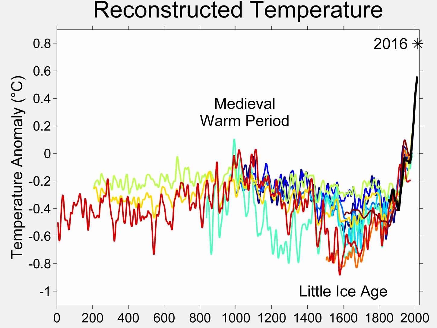
What got me into this Climate Change nonsense to begin with was finding a glaring error in the first two Earth Energy Balance I saw.  The authors truly had to force things to close their budgets.  Since then I have not been very comfortable accepting any on the "given" assumptions.  The original error was missing nearly 20 Wm-2 of energy absorbed in clouds.  That error cause the atmospheric window, or open spectrum, to be twice as large as it actually is.   Since a large part of the "fat tail" of climate sensitivity is the closing of the atmospheric window, that part is less likely than before.

The second issue I have found is the atmospheric sink temperature.  Using the current best estimates of absolute temperatures, the atmospheric sink temperature has to be approximately 184K degrees which is equal to the lowest temperature recorded on Earth.  That sink temperature is also required to have a climate sensitivity of 2.6C or more per doubling without considerable feedbacks.

This is a start to what should be a more realistic Earth Energy Budget.  You should note that there are complimentary surfaces.  The average deep ocean energy matches the average DWLR energy.  The Atmospheric Boundary Layer (ABL) approximation matches the average Stratopause energy.  The Tropopause is a complex layer.  It would radiate 65Wm-2 up to match the Meso/Turbo pause energy and 65Wm-2 down to match the "surface" actual sea level energy minus the DWLR energy.  This is nearly identical to using a static model which would required a precise balancing.

The Meso/Turbo Pause energy is not generally considered in most energy budgets, probably because of its complexity.  Atmospheric chemistry with solar ionization tends to drive this region of the atmosphere.  Ozone is the most common reference used when talking about the upper 25% of the atmospheric mass, but Hydroxyl, OH* is a major player.  Even CO2 can react with free Oxygen atoms to form unstable Carbon Trioxide, CO3 which can create some interesting possibilities.  The net result of all this ionic chemistry laboratory is a surprisingly stable temperature region some 87 kilometers to 100 km above the surface even at night.  One of the phenomena produced is OH Air Glow.

While this region is reasonably "stable" that doesn't mean what you might think.  Horizontal winds can be over 200 kilometers per hour and wind shear over 30m/s-km.  Minor shifts can produce enormous impacts.  Solar irradiance can vary the temperature at one level by +/- 20 K degrees, but a higher or lower level can remain at the "normal" 184K degrees. 

The Stratopause provides a second layer of stability by maintaining a reasonably "stable" 316 Wm-2 (0 C degrees) with less variation, about 3 K per 80 Wm-2 change in annual solar forcing. 

This compares the AQUA 41km Stratosphere layer, about 9 km below the Stratopause with the SORCE Total Irradiation Monitor (TIM) seasonal solar insolation just for some illustration.  There is a downward trend, but the period is too short make many conclusions.  If you compare the longer term solar and stratosphere, the volcanoes at the start of the record make that less than conclusive.  You are stuck with just a tease of empirical data and theory.  That should mean reviewing all assumptions and considering alternate approaches, if you want to reduce uncertainty.


One of the more interesting omissions in Climate Science is the actual atmospheric "shells" or near isothermal layers.  The chart above focuses on the lower and middle atmosphere.  These regions contain nearly 100% of the mass of the atmosphere, so the 100km altitude is normally considered the Top of the Atmosphere (TOA).  Comparing the Atmospheric Boundary Layer (ABL) which is a reasonably laminar region near the surface with the Stratopause, another reasonably stable "surface", the obvious relationship ~315Wm-2 which is approximately the effective energy of water at its freezing point, the choice of a fictitious 240Wm-2 "surface" as a reference looks a bit silly with more stable shells available.  In between these to shells is the Tropopause at a much lower temperature and energy.

The tropopause varies in altitude from ~8km to nearly 20 km with temperatures ranging from about -50 C to as low as -105 C in extreme deep convection cases near the tropics.  Just below the Tropopause is the Troposphere with its Halley Cells and Ferrel Cells that transport energy towards the poles.  This advection is the reason that the tropopause is colder while sandwiched between the ABL and Stratopause.  With a difference of 185 Wm-2 you can get a rough magnitude of the amount of advected energy.

The Mesopause has an average energy of 65 Wm-2, half of the average tropopause energy.   If you consider the Stratopause and Mesopause combined, the total energy is roughly 380 Wm-2.  Allowing the differences between the true surface area and the area of the middle atmosphere layers, there would be about 10 to 17 Wm-2 difference, so an effective surface energy of 390 to 397 Wm-2 could be the energy source. 

The MesoPause at roughly 87km and the Turbopause at roughly 100km are lower mass regions of the atmosphere.  For this reason it is assumed that their combined specific heat capacity is too small to have a major impact on climate.  However, the space blanket, a thin reflective plastic sheet, is often used for a Greenhouse Effect analogy.  In the Turbopause where turbulent mixing is so small that molecules separate into layers based on mass, Earth has the original space blanket.  Like a space blanket, the turbopause is an effect radiant barrier but not much of a general purpose thermal barrier.  If it gains much energy, it would tend to advect in the 200 plus kilometer per hour winds.  Both the Meso/turbopause and Tropopause have more advective potential impact than the ABL and Stratopause.  Since the Meso/Turbopause have a 65Wm-2 radiant impact and the Stratopause has a 315 Wm-2 impact in the middle atmosphere, this region should have its own energy budget.  

The Total Solar Irradiance average is approximately 1361 to 1366 Wm-2.  Since the middle atmosphere is also spherically shaped and rotates, the normal estimate for effective energy available is TSI/4.  That yields the range of 340 to 341 Wm-2 TOA.  The middle atmosphere is transparent and has a larger radius than the surface by 50 to 100 kilometers, depending on the shell.  This allows some degree of internal reflection and refraction that can effectively increase the surface area of the middle atmosphere relative to the lower atmosphere and surface.

With a combined 380Wm-2 outgoing and 340 Wm-2 incoming, 40 Wm-2 or about 12 percent more effective area should be required to balance the budget.  With 12 to 18 degrees of twilight region that is extremely likely.

From space the apparent TOA energy emitted and absorbed is ~240 Wm-2.  This is a purely up/down estimate which would depend on the "surface(s)"  used to determine the effective TOA.  SW anisotropic or any solar energy not in an up/down orientation would have to be huge to miss nearly 150 Wm-2.  That is not likely, but with the Mesopause energy primarily down and the Stratopause energy mainly up as viewed from space, the net would be 315-65=250 Wm-2.  Missing 10 Wm-2 is much more likely given the difference in the shell areas. That would infer that the majority of the Meso/Turbopause energy gained is not from up/down irradiance but through the longer path length SW advection through the upper and middle atmospheres.


If you can follow this and this is about as simple as I can state it, the majority of the GreenHouse Effect is an illusion.  CO2 and other greenhouse gases still have a major impact in the lower atmosphere, but the top half not so much.  That should reduce the magnitude of the sensitivity estimates by a factor of two, to ~ 0.8C per doubling or 0.195K/Wm-2.  Imagine that?


Webster update:


This is MODTRAN screen shot for 10 ppm CO2 looking up from 6.65km which results in about 65 Wm-2.


Same setting but with 750 ppm CO2, that would be 6 plus doublings from 10.  The Iout increased by 18 Wm-2.  With 6 plus doublings, the altitude of the 65Wm-2 Iout would increase to 7.65km or 1000 kilometers. 


Friday, July 5, 2013

Is the Twilight Region a Mistake? - Only the Shadow Knows

 
Since the Earth is spherical with an atmosphere that is transparent a good deal of the time, there may be more involved than simple half sphere averaging required to determine the actual solar energy provide to the "surfaces".

The Sun provides a reasonably constant 1361 Wm-2 at the top of the atmosphere (TOA) which should be approximately 100 kilometers or more above the physical sea level surface.  NASA determines the "average" Total Solar Insolation to be 1361/4=340 Wm-2 ignoring rounding choices.  That 340 Wm-2 is based on the Day Light Region illumination of a flat disc transferred to a sphere.  The area of the flat disc is pi()R^2 and the area of a sphere is 4*pi()R^2, so 1361/4 is the calculation.  For a peak insolation or day light only the TOA twice or 680 Wm-2.

Due to the transparent atmosphere, there is refraction of the sunlight at sunrise and sunset causing a twilight period.  This causes a bit of confusion as it results in Astronomical, Nautical and Civil Sun rise and set times.  Variations in atmospheric conditions can change the apparent timing of the official sunset or rise.  From the center of the Sun, Civil is 6 degrees, Nautical 12 degrees and astronomical 18 degrees below the horizon.  Nautical sunrise and sunset are the first and last moments where the horizon is clearly visible for using a sextant to determine your position by the stars. The drawing above is based on the astronomical definition of 18 degrees.  Since there are 360 degrees in a circle there are 15 degrees per hour, so the twilight periods are around one hour long.  Photographers call it the golden hour though there are actually two golden hours per day.

Part of the reason for the different definitions of sunrise is location.  On the ocean there is always a level horizon.  On land, variations in altitude and terrain can reduce the "apparent" time of first light and scientifically it doesn't matter if you can see it or not, it is there.  Despite the differences, there is light before the Sun is actually visible.


This photo borrowed from Wikipedia is a good example of twilight conditions and the orange tinge to the Moon illustrates how the warmer wave lengths of light bend or refract in the atmosphere.  That light is energy taking the longest possible path through the atmosphere.  A longer path length increases the possibility of absorption in the atmosphere.  So more than the simple disc area is illuminated at any point in time and that illumination is energy that may be absorbed at various altitudes in our atmosphere as well as the surface.

With the TOA receiving a less than ideally estimated 340Wm-2, since it does not consider the twilight region, it is not all that surprising that the effective energy of the surface is approximately 390Wm-2 or 14.7% more than the less than ideal estimated Total Solar Irradiation.

If you use the Nautical definition, 12 degrees morning and night would be 24 degrees total or 1.6 hours more than the standard 12 hour "day" period.  13.6/12=1.13 or 13% more "day" than included in the simple estimate.

I must assume that there is some "minor adjustment" made in the more serious calculations, but all the literature I have seen doesn't appear to include this twilight energy.  Imagine that?

Here is a link to NASA Earth Energy Budget and a neat graphic.


Hiding in plain sight comes to mind.


Consider the differences between Austral Summer and Winter. With greater insolation in the Southern Hemisphere, the Northern Hemisphere because of the ~23.5 degree axial tilt has a smaller full shadow region.  Greater atmospheric absorption with the higher solar input would tend to create milder Winter temperatures though atmospheric variations would cause greater variability.

In Austral Winter, the axial tilt would also reduce the shadow region as the Earth rotates, but the lower solar input would tend to cause colder average temperatures and less variability as there is less energy to fluctuate.

Atmospheric Ozone would be more variable between the poles.  With the Northern Hemisphere receiving more refracted solar energy in local Winter, the Ozone concentration would be more stable while in the Southern Hemisphere the lower local Winter solar insolation in the upper atmosphere would tend to produce less Ozone.

While there is nothing particularly new about atmospheric refraction and seasonal solar variability, simple averaging and up/down radiant modeling does not capture the range of solar energy that is available or the complex interaction between surface energy and solar energy at various levels of the atmosphere.

How much the flat Earth assumption impacts the estimates of total TOA solar energy is hard to determine since atmospheric conditions and solar variability are factors, but with ~18 degrees of twilight and an approximately 24 degree axial tilt, the near surface effect could extend to within 6 degrees of the true pole.

Think of it as a solar powered space blanket.  While the twilight hours are not the warmest of the day they are far from the coldest.  Here is a rough estimate of the possible error neglecting the twilight hours might have on the Earth Energy Budget.


Altitude Radius Disc Area % of Surface 1361 Wm-2 (1) Twilight (2) Impact (3)
Surface 0 6371 1.28E+08 100.00% 173549436567.305 340.25 356.90 16.65
Tropopause 11.2 6382.2 1.28E+08 100.35% 174160160854.165 341.45 358.16 17.91
Stratopause 50 6421 1.30E+08 101.58% 176284179149.248 345.61 362.53 22.28
MesoPause 85 6456 1.31E+08 102.69% 178211219186.722 349.39 366.49 26.24
Turbopause 100 6471 1.32E+08 103.16% 179040300269.198 351.02 368.19 27.94

(1) Equivalent energy at TOA the same diameter as the surface without twilight correction.
(2) Equivalent energy at TOA the same diameter as the surface including 18 degree twilight region (Wm-2).
(3) Possible energy budget discrepancy (Wm-2). 

Note that there are indications that Solar variability has greater influence on the Quasi-Biennial Oscillation (QBO) and Southern Annular Mode (SAM) which would be consistent with greater upper atmosphere absorption in the twilight region.  Something worth pursuing.


Also a little something on Air Glow.

  Air Glow photo taken by the International Space Station from Wikipedia.


A really Update:

 One of the Earth Energy Budget "cartoons" is in petawatts.  Since there has been some confusion in my mind about what is the actual "surface" as well as the actual TOA.  It appears that the Surface is approximately the atmospheric boundary layer (ABL) or about a  kilometer above sea level equatorial radius of ~6378 kilometers as the normal radius of Earth.  Surface selection is pretty important since CO2 forcing is only estimated to be ~3.7 Wm-2 and the range of error noted in the Wm-2 columns for TSI/4 or the flat disc estimate and the twilight uncertainty can range up to 32 Wm-2.  This budget also uses the higher 1366 Wm-2 TSI estimate which by itself is ~5.9 Wm-2 greater than the estimated CO2 doubling forcing. 

As I mentioned above, there are likely quite a few adjustments made to "close" energy budgets.  Stephens' et al. noted that due to all the variables that the "surface" energy imbalance is on the order or +/- 17 Wm-2.  Imagine that?

Thursday, July 4, 2013

Basic Umbra Considerations for a Multi-Layered Black Body

This is my attempt at a graphical depiction of the actual geometry that needs to be considered for Earth's Energy Balance.  It is not a simple TSI/4 with dozens of fudge factors to make things work out.  The reason this is required is there are two ends to the atmospheric effect, source and sink.  If you vary either or the path between the two you would vary the energy balance.

With the Sun providing ~1361 Wm-2 on average, the full area of each active layer of the atmosphere and surface should be considered.  The upper atmosphere due to greater surface area and transparency produces a lens effect providing twilight illumination to the umbral cone.  The area of the twilight regions vary with altitude and transparency of the atmospheric surfaces.  The solar radiation path length varies as well which would impact the amount of energy absorbed in the atmospheric layers.


As a rough estimate, with the Turbopause effective energy close to 65 Wm-2 and a source of 1361 Wm-2, 65/1361=0.477 or 4.77% of the available solar energy would be absorbed in the highest portion of the atmosphere.  Using the standard estimate of out going long wave radiation, 240Wm-2, the relative area of the Turbopause would be 240/65=3.69 time the effective area of the not well described "effective radiant layer" producing the 240Wm-2 of OLR.  Using the normal TSI/4 which includes half sphere area correction and abrupt day/night transition, the relative TOA umbra area would be (4-3.69)/4=0.0769 of the actual sea level surface area. 

It is likely not a coincidence that the mass of the atmosphere above the Stratopause happens to be ~4.77 percent of the mass of the atmosphere.  The mass i.e. Specific Heat Capacity of the upper atmosphere would limit that amount of heat that can be absorbed directly from the sun or indirectly from the surface as OLR.

At the Stratopuase, the effective radiant temperature is 273.15K (316Wm-2)  which as a percentage of the TSI input is 316/1361= 0.23 or 23% of the available energy.  Again, the specific heat capacity of this layer of the atmosphere, stratosphere to TOA, would limit the amount of energy it could retain.  The upper atmosphere provides limits to the total amount of radiant energy that can be retained, using repetition for emphasis.

Viewed from space, the 316Wm-2 Stratopause contained inside of a stable 65Wm-2 Turbopause would appear to be a 316-65=251Wm-2 radiant layer if the areal difference/specific heat capacities where not considered.  The appearent OLR would be ~240 Wm-2 if the differences where considered.

Since there is no stable atmospheric layer that maintains a 255K (240Wm-2) effective temperature, there is no reason to assume 255K as a reference other than mathematical happenstance.

Using a more realistic reference, the Stratopause, the ratio of effective TSI assuming a black body with no atmosphere to Straopause would be 316/340=0.929 or 92.9% of an ideal black body.

The Stefan-Boltzmann equation includes a correction for less than ideal black body performance of 0.924.

Since a large portion of the radiant physics used in climate change is based on black body approximation, it is surreal to consider number of fudges and approximations used to avoid the obvious.  Earth is not a Gray Body, but a multi-layered black body.


Wednesday, July 3, 2013

Umbral, Penumbral and Ante-umbral Warming of the the Upper Atmosphere

I constantly get sidetracked with minutia and forget to explain some of the simpler but interesting parts of atmospheric physics I am picking up along the way.  Umbra, Penumbra and Ante-umbra are parts of a shadow.  Umbra is the darkest part, because of the total height of our atmosphere, there are few hours were it is absolutely dark at any point in our upper atmosphere.  That is because sunlight is passing on its way through and because of the density gradient in the atmosphere, lens effect tends to bend the light.  At dawn and sunset, the path length through the atmosphere is the longest, meaning more solar photons can be absorbed by atmospheric gases. 

If you are not a fan of umbra, call it the sunset to dusk lag of dawn to sunrise lag.  In either case until the sun is 18 degrees below the horizon, you don't have dark dark.  The higher you are above sea level the less dark dark you experience.

If you consider that the top of the atmosphere is the Turbopause at an altitude of ~100 kilometers, 100 kilometers versus a radius of 6371 kilometers is quite small.  The area difference is only 3.1 percent.  Due to the path length though, the absorption efficiency would be some what greater for the shorter wavelengths of Sun light.

With an average solar irradiance or 1361 Wm-2, 3.1 percent absorption would be 42 Wm-2 likely not included in the energy budgets with some more possible.

So the upper atmosphere may absorb more energy than included in the basic Earth Energy Budget, no big deal right because Eout has to equal Ein and doing the normal math, it still is 341Wm-2 average, right?  Not really.  The timing is different.  During penumbral absorption the upper atmosphere would basically be preheating which would reduce surface heat loss and during ante-umbral absorption, upper atmosphere heating would be reducing the rate of heat loss.  I use reducing because this energy likely never directly impacts the surface, instead it helps maintain the upper atmosphere temperature inversions. 

In the Antarctic which doesn't have liquid sea water all the way to the pole, in winter the only energy it gets is transferred by atmospheric circulation which the polar vortex can block and the mesosphere/stratosphere temperature inversions which gain most of their energy from O2 and Ozone solar absorption.  This absorption appears to set the atmospheric sink temperature on Earth at 184 K degrees.  Since Vensus also has that magic temperature,  upper atmosphere absorption should also be there.

So far, with this ~42 Wm-2 and the ~20 Wm-2 K&T missed in the Earth Energy Budgets, we are looking a a large portion of the Greenhouse Effect that is simple math and model errors.  Kind of funny huh?

Tuesday, July 2, 2013

Don't Start Thermodynamic Problems with Telescope Observations

Again, the three real laws of Thermodynamics are KISS, ASSUME and FRAME OF REFERENCE. Long range observations make piss poor frames of reference.
My new and improved butt crack atmospheric profile provides a fine example why.  The Stratopause level of the atmosphere has a temperature of zero C which would have an energy flux density of 316Wm-2.  Notice that layer is the hips or widest point in the upper atmosphere portion of the profile.  Near the surface, there is another 0C-316Wm-2 layer.  That layer is not stable.  It varies constantly with seasons.  In between the two is the Turbopause with a temperature of roughly -60C degrees that also varies with season.  Below the Tropopause is the Troposphere or "weather" zone of the atmosphere.  There are no, as in zero, 255K (-18C) stable layers in the atmosphere.  It is a figment of telescope jockeys imaginations. 

Above the Stratopause there is the Mesosphere and the Turbopause which have minimum temperatures of approximately 184K (-89.2C) with a flux density of 65 Wm-2.  316Wm-2 minus 65 Wm-2 equals 251Wm-2 or approximately 258K degrees.  With a telescope you have no positive proof of what "surface" you are seeing.  You can base an entire career on optical phantoms.  The Faint Young Sun Paradox, the Low Gradient Paradox  and 33C no greenhouse gas Earth are products of Phantom chasing.

33C Earth ASSUMES, there is a real 255K layer and no greenhouse gases.  The temperature in the Stratosphere and Stratopause is due to both solar absorption in the upper atmosphere which produces Ozone, a greenhouse gas, and absorption of outgoing surface energy by that Ozone.  You cannot have a no greenhouse gas Earth if there is oxygen in the atmosphere that can be converted to Ozone by high energy solar irradiation.  The actual surface of the Earth is mainly salt water.  That salt water produces the clouds that provide the majority of the reflection of solar radiation.  The clouds are a response to solar warming not a fixed number or painted on a child's snow globe.  The probability of there being solid ice at the equator with no clouds is so close to zero it is ridiculous.  If there is open water at the equator, the solar absorption of that liquid surface a local solar noon will be on the order of 99.999%.  A portion of that absorbed solar energy will penetrate to depths of up to 200 meters.  The thermal conductivity of salt water at 30g/kg is ~24 times greater than the thermal conductivity of dry air.  The oceans will gain more energy than they lose and that energy will advect poleward.  With warming liquid oceans there will be water vapor transferred to the atmosphere.  Water vapor is also a greenhouse gas.  The "average" condensation temperature of water vapor is 0C degrees or 316Wm-2, just like the Stratopause.  Imagine that?

So the next time some telescope jockey tries to explain Climate Change to you with the 33C "discrepancy", show him your butt crack atmosphere profile.