New Computer Fund

Monday, December 31, 2012

Radiant Layer Meet Golden Efficiency

The wind is blowing today so thought I would play some more with the Golden Efficiency concept.  The issue is that an ideal grey body, if one could exist, would have an emissivity of 50 percent.  Reading back through some of my stuff and a slightly failed post on realclimate.org, isothermal radiant layers can only emit what energy that they receive.  Because of the concept, an isothermal radiant layer would emit the exact energy up as it does down and being isothermal, the advection of energy in the plane of the isothermal layer could be neglected.  This is roughly the assumption required for the simple up/down radiant model.  

Ideal is a concept not a reality.  50 percent is purely based on the point where transmission from the surface equal emission at the top of the atmosphere.  The surface would have twice the energy available that is applied.  If the surface could store more energy, the system would run away creating second law issues.

The slightly failed realclimate post had a technical note that was botched then corrected.

[Technical digression: Imagine an atmosphere with multiple isothermal layers that only interact radiatively. At equilibrium each layer can only emit what it absorbs. If the amount of greenhouse gas (GHG) is low enough, each layer will basically only see the emission from the ground and so by Stefan-Boltzmann you get for the air temperature (Ta) and the ground temperature (Tg) that 2 Ta4 = Tg4 , i.e. Ta=0.84 Tg for all layers (i.e. an isothermal atmosphere). On the other hand, if the amount of GHGs was very high then each layer would only see the adjacent layers and you can show that the temperature in the top layer would approximate 0.84n Tg (n+1)-1/4 Tg, (see note) where n is the number of layers - much colder than the low GHG case. Hence the increased GHG steepens the surface-to-top temperature gradient.]

If you use the corrected form, ideal isothermal radiant layer would be:


Layer Emissivity
1 0.84090
2 0.75984
3 0.70711
4 0.66874
5 0.63894
6 0.61479
7 0.59460
8 0.57735
9 0.56234
10 0.54910
11 0.53728
12 0.52664
13 0.51697
14 0.50813
15 0.50000

I have used the label "Emissivity" instead of temperature since they should be interchangeable at these specific layers.  Based on this idealize model, 15 layers would produce the ideal grey body.

As the density of the atmosphere increases, the ideal isothermal radiant layer concept falls apart.  There will be advection and energy store as potential.  The advection or difference in rates of advection between adjacent radiant layers more specifically, is analogous to radiant scattering that is not easy to keep track of.  In the denser parts of the body, the Golden Efficiency may apply.  I am still not convinced, but there are quite a few coincidences.

Stage Efficiency Waste
-3 0.008131 0.991869
-2 0.021286 0.978714
-1 0.055728 0.944272
0 0.145898 0.854102
1 0.381966 0.618034
2 0.618034 0.381966
3 0.763932 0.236068
4 0.854102 0.145898
5 0.909830 0.090170
6 0.944272 0.055728
7 0.965558 0.034442
8 0.978714 0.021286
9 0.986844 0.013156
10 0.991869 0.008131


In the above table used in the Golden Efficiency link, I used stages noting that stage 2 was remarkably close to the TOA emissivity.  In the isothermal layer table, layer 6 is also close to TOA emissivity.  In a totally unscientific manner, I decided that could be more than just coincidence.  That could be a reasonable transition from a reasonably accurate isothermal radiant layer model to a golden efficiency model.  The weakness of the radiant model, advection, could be related to the stages of the Golden Efficiency.

Stage Efficiency Emissivity Advection
-3 0.008131 0.53728
-2 0.021286 0.54910
-1 0.055728 0.56234
0 0.145898 0.57735
1 0.381966 0.59460
2 0.618034 0.61479 0.00325
3 0.763932 0.63894 0.12499
4 0.854102 0.66874 0.18536
5 0.909830 0.70711 0.20272
6 0.944272 0.75984 0.18444
7 0.965558 0.84090 0.12466
8 0.978714 1.00000
9 0.986844 --
10 0.991869 --


By combining the two tables, the only positive differences for "advection" for the using the rough TOA emissivity are between the TOA and surface for this fit.

Stage Efficiency Emissivity Advection
-3 0.008131 0.53728
-2 0.021286 0.54910
-1 0.055728 0.56234
0 0.145898 0.57735
1 0.381966 0.61479
2 0.618034 0.63894
3 0.763932 0.66874 0.09519
4 0.854102 0.70711 0.14700
5 0.909830 0.75984 0.14999
6 0.944272 0.84090 0.10338
7 0.965558 1.00000
8 0.978714 --
9 0.986844 --
10 0.991869 --

A likely better fit is where the radiant emissivity is closer to the Golden Efficiency waste energy.  In this case the ideal black body emissivity of 1 is compared to the more realistic ocean surface emissivity of 0.9655.  The total "advection" for this case is 49.6%, so for a TOA of 240Wm-2, advection would be 118.6Wm-2 resulting in an "effective surface" energy of 358.6Wm-2.  Since the "true" surface energy is only approximated at 398 +/- 17 roughly with sensible convection and "surface" atmospheric window radiant on the order of 40Wm-2 total, this fit is rather comfortable.  That of course means that the other is more appropriate or both will be needed since the "surface", as far as the radiant model is concerned, is not a very clearly defined layer.

This may be just numerology, but there are plenty of coincidences that make the less than perfect fit perfectly logical.


Is there a Trend?


There is a new paper out on with these bullet points in the abstract:

Key Points
  • I am using a novel method to test the significance of temperature trends
  • In the Eurasian Arctic region only 17 stations show a significant trend
  • I find that in Siberia the trend signal has not yet emerged
The paper, On the significance of surface air temperature trends in the Eurasian Arctic, by C. Franzke, is being discussed on Realclimate and the BlackBoard by folks much more qualified to discuss, "novel methods" is signal processing than I am.  I have been mystified by the "novel" methods for some time since they often avoid the obvious.

The obvious to me is the graph above.  Iceland would be a great spot to monitor if you didn't have many spots to monitor.  The western coast of South America is another great spot if you are looking for long term climate trends, then I am an on the water kinda guy.

From the paper, 

 Out of those 17, only one station exhibits a warming trend which is significant against all three null models. The stations with significant warming trends are located mainly in Scandinavia and Iceland.

I have been using the BEST Tmin data and diurnal data for a while since it would be more closely related to "greenhouse effect" impacts.  The "greenhouse effect" reduces the rate of cooling and that would be most noticeable a night or Tmin.  I am really anxious for the new global BEST data to hit the internet since that should use real marine surface air temperatures instead of a hodge podge of bucket, engine intake and spot coastal measurements.  Once that is out, a lot of the mystery will see some light.

Until then, Best Tmin temperatures from places like Iceland, Oceania, the Galapagos Islands and such tend to indicate that the oceans have been warming from well before 1950 in fits and starts.  That is not exactly a great indication of CO2 forced climate change.  More like natural internal changes with a dash of land use, IMHO, though you can tease out a tad of atmospheric forcing change likely due to CO2 influences.  

Now this paper is new and with "novel methods" will be questioned by many that often employ "novel methods" to get results in their "range of comfort".  Time will tell and I would not be the least surprised to see a statistical face plant or two in the discussions.

Sunday, December 30, 2012

Golden Musings and Bottle Necks or How to Introduce Selvam's SOC Concepts to Climate Models

The Bottle Necks

Energy is fungible, the work done is not.

Energy is energy.  It can't be created nor destroyed, but you can convert it to your hearts content with some loss with each conversion.  You can convert wind power into mechanical power to pump water into a water tower then use that water and the head pressure (height) to drive a turbine to make electricity to power a fan to turn your wind mill.  That would be a complete waste of time, but energy is energy.  Each stage of the conversion processes requires work.  Since you lose energy due to inefficiency (entropy) doing the work, each stage has to be considered separately.  Since Work and Entropy are joined at the hip so to speak, the energy is fungible but the work done is not.

A radiant surface cannot emit energy any faster than energy can be transferred to the radiant surface.

This is one of my favorite reminders that is almost always missed.  It is a reminder that there is no such thing as a perfect black body.  When I mention conductive heat transfer most think I am daft, but there are only two direct means of heat transfer, conduction and radiation.  Latent and convective heat transfer has to be initiated by either conduction or radiation.  Since a large "black body" with enormous amount of energy stored has to rely on conduction and conduction initiated convection to transfer heat to the radiant surface, conduction is not a bit player.

So why do I tend to make such obvious comments?  Because they are the main two bottle necks.  Bottle necks are natural control limits.

When I wander off into Selvam's Golden Ratio land, it is because the Golden ratio actually makes sense.  Not the 1.618033 etc., but the 0.618033- and 0.381966- parts.  0.382 is very close to the maximum reliable efficiency of a single cycle heat engine.  A combined cycle heat engine can reliably produce 0.618 percent efficiency.  That is the 0.382 of the base cycle and 0.382% of the waste heat 0.618 percentage which happens to invert the work to waste ratio.

 
 Using the Golden Efficiency, the table above lists the stages required to achieve a desired efficiency if you use all of the waste heat for the next stage,above stage 1.  Below stage 1, the efficiency drops off rapidly.  Since efficiency cannot be greater than one (100%) and waste energy cannot be greater than the available energy,  only factors of the Golden Ratio would apply to efficiency.  The curves to the right are the theoretical control range for a "Golden Efficiency" world.  

Now think of the two bottle necks.  Going to the right, as efficiency increases more "work"is done per unit effort.  Going to the left,more energy has to be transferred in order to generate the "waste".  The time and effort to store that energy limits uptake and the properties of the energy storage media limits the rate or release of the energy.  There is only one point on the curve where the two are equal.  Depending on your perspective, that point would be maximum or minimum entropy or the point where the most rapid change in both work and entropy is possible.  That is a control point.

 The "waste" energy which is limited by the ability of the object to transfer energy, is the emissivity of the object.  The "work" done, which is limited by the ability of the object to store energy, is effectively the absorptivity of the object.  The two are related, but only equal at perfection, which glancing at the Golden Efficiency chart, doesn't exist as a stable point.  There is a stable "range", but not a stable point.  An excellent property for an effective control system by the way.

Now I am in the midst of my busy season, so I doubt I will spend much time on this for a while, but there may be some enterprising modelers, probably from India, that might like to play with Golden Efficiency Stages concept.  With a quick glance one should notice that 0.618 is close to the TOA emissivity and 0.9655 is close to the absorptivity of salt water.

Probably one of my crazier ideas, but hey, what's the internet for?


Saturday, December 29, 2012

Energy is fungible, the Work done is not

A little blast from the past.  K. Kimoto published a paper in the often trashed Energy and Environment journal.  E and E developed a contrary policy of publishing more controversial papers.  During the bad old days of "pal" review, there were not a great deal of options for scientists, professional and not so professional, to publish.  So with the cliquishness of Climate Science, any and all papers published in a "trash" journal along with the authors are contaminated.  I have always been of the opinion that the reader should determine the value of the content he chooses to read.  I don't shun Nature just because it has and will continue to publish tripe, there are papers that are of value even in Nature.

Why would Nature or any other scientific magazine publish tripe?  Because science progresses.  A journal likes to publish "ground breaking" science.  It is good for business.  The only problem is that only one "ground breaking" paper in hundreds is likely to be truly "ground breaking".

I am familiar with the K. Kimoto, "On the Confusion of Planck Feedback Parameters", because the paper that Kimoto used in his paper was outdated and contained a major error.  That is right sports fans, the Kiehl and Trendberth Earth Energy Budgets were flawed.  K&T misplaced approximately 20 Wm-2 of energy that was absorbed in the atmosphere.  This gave K&T a 40 WM-2 surface to space atmospheric window which adding CO2 to the atmosphere would cause spectral broadening closing a portion of the over estimated Atmospheric window producing greatly over estimated climate impact due to a doubling of CO2.  Kimoto noticed that there was some error, but mistakenly assumed that K&T could actually add.  As a result, K. Kimoto's paper was rubbish because it was based on rubbish that had been published in a "proper" peer reviewed journal and widely distributed to the public as an icon of climate science, much like the Mann Hockey stick.  Science progresses.

That brings us to the title of the post, Energy is Fungible, the Work done is not.   That 20 Wm-2 is absorbed energy that does work.  It produces a substantial portion of the atmospheric effect that keeps the Earth's climate rather stable.    That work happens to be done in the moist air portion of the atmosphere which excludes it from being a positive feedback to additional CO2.  The amount of energy absorbed in the moist air portion of the atmosphere may well increase, but 20 Wm-2 of that has already happened and cannot be considered a future impact.

I thought some might get a chuckle out of this.  BTW, Professor Kevin "missing heat" Trenberth has corrected that error with a "minor adjustment" in his recently published revised Earth Energy Budget.  :)

Thursday, December 27, 2012

The Antarctic is Warming Faster than any Place on Earth?

Oh the humanity!  I noticed that yet again, Dr. Eric Steig of the University of Washington, has mentioned that The Heat is on in the West Antarctic.  Dr. Steig, the genius behind the previous Nature article on Antarctic warming that got a warm reception until the methodology was challenged by a bunch of unscientific statisticians led by O'Donnell and master of out of context debate, still seems to believe that his version of the scientific method is sound.  If you happen to have some spare time and need a laugh, visit Real Climate and Google Antarctic.

Above is the temperature data for the Amundsen Scott Antarctic station temperature anomaly.  In blue is the actual anomaly and in orange is the anomaly adjusted to zero C degrees.  Since the average annual temperature average is less that -30C degrees, it doesn't take much energy to produce large swings in temperature.  If is pick just the right smoothing and the perfect start time, I could pull a Steig and have a warming Antarctic.  If I cherry pick a paleo reconstruction that happens to "jive" with my agenda, I could show that the Antarctic is warming or cooling or staying the same.

What I have mentioned in the past, is that the Antarctic "trends" tend to be out of phase with "global" trends.  Starting in roughly 1987 to 2000, when the "globe" experienced the most recent warming, the Amundsen Scott temperatures appear to have trended cooler.  Starting in roughly 2000, when the "global" temperature trends appears to have paused, the Antarctic appears to have warmed.

It would take some pretty creative math to "Steig" a trend consistent with atmospheric CO2 concentration increase.  Where there is a will though, there is a way.  So for this month at least, climate "science" is pretty sure that the Antarctic, at least in the west, is warming faster than any place on Earth.  :)

Monday, December 24, 2012

How would you use the Carnot Efficiency?

Happy Holidays!  While something finishes baking in the oven, I thought of a quick post.  A denizen asked about using the Carnot Efficiency for validating climate models then automatically leaped to a comparison of Earth and Venus.  Apples to oranges in my opinion.

My example is peanut butter between two Ritz crackers.  Squeeze the crackers together and the peanut butter oozes out the cracks.  Since Venus is more isothermal, the cracks are much smaller so less peanut butter oozes out.  Carnot efficiency determines the ideal peanut butter ooze.

When you have a closed system, you have a pretty good idea of how much temperature is available and how much energy is lost or used for some purpose, but with an open system like Earth we really don't know much.  With what little we do know, we can compare a few things then use the things you know pretty well as boundaries.  Then you can compare a number of Carnot engines to see what makes sense.

One of the biggest problems is you have to have a pretty good idea of the Th and Tc or the maximum and minimum temperatures or energy available to the engines.  Since the engines interact, you can either overly simplify or overly complicate the interactions then instead of peanut butter, you end up with cheese and it can fall off your cracker :)

That may sound a little confusing or harsh, but the normal fluctuation in Earth climate is likely equal to or greater than the potential impact of a quadrupling of CO2.

My example of a rough use of Carnot efficiency was Th=306.5 to Tc=184.5, where Th is the warmest SST ever recorded and Tc is the coldest temperature ever recorded on Earth.  Using those temperatures, the Efficiency would be 1-(184.5/306.5)=0.398  which compares well with the top of the atmosphere emissivity or ~60 to 61.  That would imply that the peanut butter ooze is 60 to 61 percent and the work would be ~40 percent.  I used Ritz crackers for a reason though.  Ritz crackers are discs.

In space, the two disc radiant model works great.  There is little reason for any significant amount of energy to slip out from between the crackers.  Once there are more molecules to interact, peanut butter ooze has to be considered.  So the ~40 efficiency of the Earth, using 306.5 and 184.5K degrees, includes an ooze amount.  This ooze or energy transfer from the equatorial source to a uniform envelope of 184.5K that is mostly in the higher tropopause but can also be at the surface, is a pain in the Carnot Efficiency ass.

That is exactly why I concentrate on simple models with true isotropic energy flow.  This is also why I look at lots of ocean paleo data and the Selvam Self-organized Criticality work.  One engine's ooze is another engine's input.  I think we need to know a lot more about the normal ranges of the engines before we can predict much of anything.

That is just me though, how would you use the Carnot efficiency?


Times up!

How about assuming a standard efficiency?  Instead of about 40 and about 60 assume 38.2 and 61.8 percent.  Then Selvam's Golden Ratio would be the standard efficiency ratio.  

This may not be a crazy as it sounds.  A conventional gas turbine efficiency is close to 38.2 percent.  In combined cycle, 38.2 percent of the 61.8 heat loss is 23.6 percent yielding a total efficiency of 38.2+23.6=61.8 percent.  Then with a TOA Eout of 240 being 61.8 of the total energy available, the effective surface energy would be 388 Wm-2. Since that 388 Wm-2 would also have an efficiency penalty or work potential depending on your perspective, of 148 Wm-2, the "Golden Efficiency" may provide a baseline missing in the chaos of climate and climate data.  The only issue is that in the "Golden Efficiency" world, temperature and energy are not interchangeable.  
  

Saturday, December 22, 2012

Is there any Legitimate Reason to Assume Warming greater than 1.5C?

It is a simple question.  With the data we have now, the estimates for at least the transient "sensitivity" to an equivalent forcing of a doubling of CO2, approximately 3.7 to 4.1 Wm-2, are decreasing to a range of roughly 0.8 to 2.1 C degrees.  The base "no feedback" sensitivity to a doubling is 1 to 1.5 C degrees.  All warming greater than that requires amplifying of positive feed backs that are not currently showing in the data.

The atmospheric effect or the limiting impact of "surface" heat loss due to all the properties of the atmosphere, is approximately 334 Wm-2 with an uncertainty range of 15 Wm-2 by my estimation and 345 +/- 9 Wm-2 per the Stephens et al energy budget, is produced by the total thermal energy stored by the "true" surface, mainly oceans.  Since any amplification that may exist is include in the atmospheric effect, for a small change, 334Wm-2 to 338Wm-2 it is unlikely that there will be more than a minor amplification since the increase in "true surface" would offset warming near the rate it currently offsets warming.

The average energy of the bulk of the oceans is approximately 4C degrees or 334.5 Wm-2, the ocean quite likely produce the energy that creates the majority of the atmospheric effect.  Land area in the habitable range, that excludes the Antarctic and most of Greenland is only 20 to 24% of the surface area and has already been developed to a great extent.  There is little in the way of glacial expanses left to be impact other than Greenland with will take centuries of more to melt based on most estimates.

So is there any legitimate reason to expect warming greater than the no feed back climate sensitivity?

That is the center of the debate.  Not that CO2 does not have some impact, just what is the reasonably expected impact.  Most "advocates" tend to provide unreasonable, alarming, overly confident high estimates.  Provide a valid reason to expect more if you do.

Friday, December 21, 2012

The Moisture Model and Quondum's Comment

Quondum posted an interesting comment on Dr. Curry's Blog.  It is interesting to me because it is very similar to the moisture model I have been playing with.

The moisture model considers the freezing point of water as a reference thermodynamic boundary layer.  Energy is applied at the equator and migrates toward the colder poles.  For simplification, I use the Effective Energy based on the Stefan-Boltzmann relationship instead of temperature.  The diagram above shows some of the transitions, or other thermodynamic boundary layers that may need to be considered.  Averaging can be either a simplification or a "gotcha" in a complex model.  At the transition from 425Wm-2 to 334.5 Wm-2 in the oceans, the energy flux to the atmosphere and the single 316 Wm-2 moisture boundary changes and at the 316/307 Wm-2 block, there is not only another shift, but an inversion in the ratio.  The 316Wm-2 is "fixed" by the properties of fresh water, but the 307Wm-2 can change with the salinity of the actual ocean water.  Note that the only fixed value is the 316Wm-2.  For a radiant model, the only "fixed" value is ~240Wm-2, the approximate value of the total solar energy absorbed by the "surface".

Since the oceans absorb most of their energy near the equator, the absorbed energy is roughly twice the "true" surface absorbed energy used in radiant models.  Shown above as ~345 Wm-2 and the majority of the internal energy of the oceans migrates to the poles.  For the oceans, a different set of "averages" apply than would apply to the atmosphere.  There is effectively two greenhouse effects, an atmospheric "greenhouse" and an ocean "greenhouse" with two different "average" source and sink values, gotcha!

Quondum would run into this same situation with his/her Helmholtz free energy model.  Since the oceans constantly shift from fresh to saline dominate modes, there will be roughly 9Wm-2 of "slop" in the reference isothermal layer common to both the atmospheric and ocean systems.  This is not an insurmountable obstacle, but would require very close attention to the "bookkeeping" when determining the dissipation energy.

To add to the complexity, the poles are not uniform sinks for either the oceans or the atmosphere.  The Southern pole is a much better ocean sink and the Northern pole a much better atmospheric sink. Since the southern pole is a better sink for the majority of the heat capacity of the total system (the oceans), it would more likely limit the "sensitivity" of both atmospheric and oceans to any uniform common forcing.

Wednesday, December 19, 2012

Interesting Comment


When I see the phrase “equilibrium climate sensitivity”, it’s clear to me the writer has no understanding of the meaning of either equilibrium or climate sensitivity. The latter is no more an equilibrium parameter than the conductivity of a 1M KCl solution. Were I to be generous, I might suppose a steady-state sensitivity was really meant, but steady-states are not equilibrium states and require a steady input of energy to prevent their relaxation towards equilibrium. It is the dissipation of this energy which goes to the heart of understanding climate sensitivity.
It has been increasingly apparent to many observers that something is wrong with the theory underlying computer simulations – and it’s not just a matter of parametric tunings for aerosols, etc. I can see two worthy questions for technical discussion and resolution wrt to the whole GHG fiasco.
1. Why is current AGW/CAGW theory wrong and how are its shortcomings manifest in its conclusions?
2. Is there a better analytical approach?
As to the first, mathematical descriptions of convection and feedback do not yet rise to the level of even being wrong.
As to the second, I believe there is. Current models are formulated in terms of the differential calculus – beloved of all programmers. For the analysis of complex problems, the integral calculus has some distinct advantages – e.g. thermodynamics. An elementary example: the Carnot equation for the maximum amount of useful work obtainable from a heat engine operating between two given temperatures. Within such an engine, convection is surely involved. Here we have a rigorous result for a process which has yet to be understood microscopically but can still be described in terms of a functional relation between surface fluxes and potentials.
Without spoiling your fun, I offer you three postulates:
Ju = Jf + TJs
div Ju = 0
div Js = Ju dot grad(1/T)
The first is a Helmholtz expression connecting local flux densities of energy, free energy, and entropy. The second, a definition for the steady state. The third, Onsager’s expression for the local creation of entropy.
From these postulates, one can derive a rigorous expression for the climate sensitivity of any system bounded by two isothermal surfaces through which only energy enters and departs.
Hint: define sensitivity as the change in free energy dissipation wrt the temperature of the warmer interface.
IMO: If you want to talk about climate sensitivity show the math, not the rhetoric.
PDQ
Stolen from Dr. Curry's Climate Etc.
Close in my opinion.  The problem is still the Tale of Two Greenhouses.  

I am totally into the idea of isothermal boundary layers and the static model with moist air boundary allows estimation of dissipation through that "envelope", but the overlap of the ocean/atmosphere isothermal boundary layer complicates Quondam's elegant but not quite there model concept.  One hell of an improvement though.  
There is still the minor issue of time frames.  60 years appears too short for a reasonable estimate on the ocean energy flux, with a likely 1470 +/- 500 years pseudo cycle which could have a +/- 1C impact.  
Oh, there appears to be a new member of the SOC club :)


Sensitivities

The atmosphere is being impacted by more CO2 and more energy can be retained at the surface because of that.  The oceans are the big "retainer" and respond to the "surface".  Does the ocean and atmosphere share the same sensitivity to forcing?  In the Tale of Two Greenhouses, I point out that I don't think so.

In the post, What is the Gain?, I explore the noise that could be in the data we use to determine the "sensitivity".  Because of the work of A. M. Selvam, Self-organized Criticality - a Signature of Quantumlike Chaos in Atmospheric Flows, I put together a little "what if" spreadsheet.  Since the SOC would tend to create self similar repetative patterns on all scales, the Atmosphere and the Ocean flows should exhibit similar quantumlike chaos, with slight differences.  The ocean have a hard limit, freezing which should impact their response to atmospheric changes.  Pretty simple, the time scales would be different since the fluids are different.

The impact of CO2 in the atmosphere is at the Effective Radiant Layer(ERL).  What temperature, energy and shape that ERL has is not well known.  Because of the lower density and greater allowable distances, the chaotic patterns in the atmosphere are much greater than the oceans on shorter times scales.  With all that chaotic flow, pin pointing anything to use as a reference is difficult.

Using powers of Phi, the Golden Ratio as a subtitute for distance, I made a table of energy levels that would "fit" the Selvam concept as I understand the concept.

Now assuming that 4.1Wm-2 is the doubling forcing for CO2 and ~190Wm-2 is the value of the ERL, that spread sheet produces this table.

In the white row under under "surface" the 1.536 would be the "sensitivity" to a doubling of CO2 if that produce 4.1Wm-2 of additional "forcing".  If you look to the left and up, the tropical "surface" forcing would increase by 10.7 Wm-2.  We know that does not happen quickly, and if that should happen, then there would be a large increase in evaporation, the feedback that would produce 2/3 of the ultimate impact.


The oceans have less freedom, so this chart is limited to roughly the lowest energy level that liquid saltwater might obtain, below 302Wm-2 they would be frozen.  With the same 4.1Wm-2 of forcing applied to the ocean "surface" in the tropics, there is much lower "sensitivity", 0.58 instead of 1.536.  Since Earth does have seasons, ice will form at the poles in winter and melt in summer.  As long as ice exists, the oceans will have a different sensitivity than the atmosphere.

Now I have no idea how well Selvam's work and the Golden Ratio apply to climate, but this overly simple application does tend to fit what I would physically expect, there is more noise in the atmosphere and less noise in the oceans.  The oceans, with a 1000 times the heat capacity of the atmosphere will impose limits on the response of a doubling of CO2.

Now you readers need to remember that CO2 forcing is a sideshow to me, beyond a "sensitivity" range of .5 to 1.5 C per doubling there is nothing but unknowns.  Because of the self-organized criticality, predictions of future climate is limited to a range of probability, but including that range as possibly due to CO2 is pseudo-science.  Instead of 1.5 to 4.5, a realistic range of future climate is more like +/- 3 with 0.5 to 1.5 CO2 bias or -2.5 to 4.5 C degrees(actually, -1.5 to 3.5 is more realistic since sensitivity decreases with temperature, but -2.5 to 4.5 allows for more uncertainty.).  Without knowing were we are in the normal "noise" we cannot predict what our CO2 amplification/buffering will produce.

So expect to see more articles like this, Matt Ridley: Cooling Down the Fears of Climate Change since more folks are realizing there is a flaw in the Greenhouse Effect logic.  It is still a Tale of Two Greenhouses.

Tuesday, December 18, 2012

What is the Gain?

There are tons of scientists, real and not, looking at the huge mountains of data on climate change and a surprisingly large number think they have found, THE, A or SOME solution, including me.  I am in the A solution group.  A reasonable solution from one specific base period with a large but realistic error margin for one specific change.  If we increase atmospheric resistance to radiant cooling the "true" surface, the oceans, will increase in temperature by 0.8 +/- 0.2 C degrees.  Since the full impact of that increase will take 300 to 500 years roughly to be realized and the "solution" is only related to an increase in atmospheric resistance to radiant cooling, the range of possible change that could be experienced is roughly -3 to +3 at the "surface".  That could be larger or smaller, but without a better estimate of what the "true" absolute "surface" temperature is, who knows.

Since I am confident (or over confident if you like) in my "sensitivity", 0.8 +/-0.2, I am curious about the gain.  Since there are other impacts that can be amplified by atmospheric "signal", mainly regionally, which I don't consider major "feedbacks" to the longer term "equilibrium" condition, those might have an impact on "global" "sensitivity"  which would prove me wrong.

I completely expect there to be over shoots as the system hunts for some form of a new equilibrium.  Just looking at the paleo data standard deviation of 4.2 for the atmospheric surface and 0.82 for the ocean surface, there is a gain of 4.2/0.82~= 5 causing a fluctuation of +/-2.5 C degrees.  If anything, increased atmospheric resistance should damp that fluctuation somewhat.  In other words, atmospheric resistance changes the gain of the system.

This chart is a trial balloon.  The Golden Ratio is interesting in terms of a controls perspective. By using the square root of the Golden Ratio as the exponential value, you can get the blue curve and the orange is the ratio of the blue curve to the input value or x axis.  Between 1 and almost -1, would be a control range.  Between -2 and about 4 is the "slop" range where the system could be spiked and still return to "set point".  Below -3 there is zero gain.  Above ~4 there is a slow drift to complete loss of control.  Since an amplifier is limited by its applied voltage or available energy, it should take one hell of an impulse to drive it to complete loss of control.  Because of the two transitions at ~-1 and 1, there would be two semi-stable "set points".  So if the Golden ratio is the cat's ass of non-ergodic system control, the gain is {(1+5^0.5)/2}^0.5 or 1.2720196... which CO2 could possibly change, dunno.

That would mean that my +/-0.2 error is a little light, more like +/- 0.217, but I can live with that.

So we have ~240 Watts applied, with the gain, 240*1.2720..=~309 is the ocean amplification which is amplified by atmosphere yielding 309*1.2720..=~388Wm-2 if we lived on a perfect world.  388:240 with the proper decimal points, is the Golden Ratio.  In our imperfect world, the ocean half receives more energy, ~248 yielding 316 and 402Wm-2.  Since the oceans are the main energy storage, we get our more realistic range.  The ~306 and ~316 could be solid limits imposed by the freezing points of water and salt water, which agrees with what I had guessed before.  If CO2 increases the gain, I am wrong, if CO2 shifts the set points by reducing the gain, I am right. With ice as reference the shift would be limited by the 316Wm-2 upper and roughly 309Wm-2 lower ranges( 306 to 316 based on the GR).

All this is pretty much just numerology at this point.  I don't have any way to prove squat, but I can fine tune predictions and see what happens.  There may be some Golden Ratio fans out there that may, so go for it, but IMHO the GR does make a great controller gain.  The problem of how to relate the GR to the needed energy flux and distance in the phase space remains.


The spread sheet above shows one of my crazier ideas, using the GR powers and roots for distance.  309 is the rough mean of the heat of fusion range set by salt water.  The "distance" from 309 to the maximum sea surface effective energy (~500) is phi.  Half way between 500 and 309, 1/2 phi, is 393, a possible stable "average" based on water limited by the heat of fusion.  2 phi from 500 is 190, a possible radiant limit for air with 309 as an "average".  So if the Golden Ratio does produce semi-stable operation, factors of phi could be substituted for distance, at least, in a simple model.

Note though that since climate appears to be bi-stable, the second semi-stable operation region based on 316, fresh water heat of fusion, could produce the second strange attractor.  The two would by no means ensure a fixed range of operation, but could improve the estimate on the probability of operation within the ranges set by the 309 and 316 strange attractors.

As I have mentioned before, this could be a complete waste of time.  It is amazing to me though that the GR does produce a good "fit" with the original static model, but in a chaotic system you can find just about any relationship your little heart desires.

There may be more on this later, in any case, the dimensions in the chart could be used for a kick butt tile pattern :)

UPDATE:


I forgot to add the gains.  Unlike simple harmonics, the Golden Ratio would produce Golden Harmonics.  The chart above shows the values for each of the lines in the previous chart with the product from 1/16 to 2 phi.  A two phi world would have larger scale events.


In a one phi world, there are still large events that occur with synchronization and more noise, the smaller product.  A noisy world is a more stable world if the Golden Ratio is valid.

Since I have it handy, this is some more Golden Noise using the "frequencies" phi to 1/16 phi with the gain set to the "frequency".  The first signal is 1.618... times the cosine t*1/1.618... etc. for the other signals.  It appears to be random noise, but there is a signal.  My FFT module is prone to crash, but you can dig out a 41ka signal if you set t to be years.  It would be fun to see how many frequencies a diligent signal processing jukie could isolate :)

Sunday, December 16, 2012

No Butterflies Today

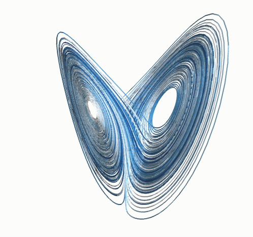
The Lorenz butterfly is a shape not a cause.  The image borrowed from Wikipedia shows the shape and  it is a solution for a set of Navier-Stokes equations.  The ratio used for the box boundaries of the "system" is 8:3 or 2.666....  to 1, so there is a solution, it just takes a while.  The two holes in the shape are called strange attractors.  The link provided is a simple explanation, which is perfect for me right now.  I am not looking to solve complex with refined math, I am looking for cheats or rules of thumbs to use for "close enough"estimates.

What is interesting is that the 8:3 ratio is close to the square of the Golden Ratio.  The Golden Ratio is used in many non-ergodic problems.

I get in trouble with the real chaos guys using ergodic and non-ergodic.  There are lots of types of chaos, some have useful "solutions" or probability densities and some don't.

"In mathematics, the term ergodic is used to describe a dynamical system which, broadly speaking, has the same behavior averaged over time as averaged over the space of all the system's states (phase space). In physics the term is used to imply that a system satisfies the ergodic hypothesis of thermodynamics." from Wikipedia again.
Ergodic there is equal probability of a particle occupying any portion of the phase space, non-ergodic, not the same.  The time frame is important, perhaps more important to me than it should be, because I consider more things non-ergodic.  That doesn't mean that they can't show ergodic behavior over a reasonable time frame.  So it is a bit of a semantics standoff.

Climate is non-ergodic because of entropy.  Nothing in the distant future will be the same, continents drifts, volcanoes erupt, earthquakes shift things, erosion washes things away and man among others does stuff.  Every thing is constantly evolving and de-volving.  But, the probability of things being in a range for a "reasonable" time frame is pretty good.  I am just not in charge of "reasonable".  The Golden Ratio does appear to be somewhat useful in estimate the range just not the time.


This is a simple chart of a 4.1 period sine wave and its first three harmonics.  Since I reused the chart for a number of plots, this is double but you should get the drift.  The first harmonic has the most impact then yada yada.  Predictable results with typical noise.


This chart is of 4.1 and 2.15 period sine waves, related to the 41ka and ~21.5ka obliquity and precessional orbital cycles respectively.  Pretty obvious.


This chart is the same 41 and 21.5 main cycles with the one version of the possible Golden Ratio equivalent of harmonics.   That is just the main frequency divide by the Golden ratio, then again and again.  There are other options, since any power of the GR could be used.  The GR is not repeating, but at some point in time the minimum would be close to -2 instead of -0.8.  For the past 800ka years paleo data indicates that there is a rise in average temperatures, but that is for a later post.

The distribution of the ocean area per hemisphere is unequal with the NH having less and the SH more. If there were no sea ice, the NH above 25N would have about 76 units compared to the SH 124 units.  That is a ratio of 1.63 and with sea ice change the ratio would pass through the GR.  From 45N the ocean units are about 35 for ice free with the SH at 60 units, a ratio of 1.71, larger gap from the GR but since NH sea ice is more variable, the ratio could get close to the GR squared or the SH ice extent could expand to reach the GR ratio.  There is no perfect match of the GR, but it is obtainable without lots of imagination required.


Using the ocean ratios instead of the GR, the curve looks like thing.  As you can see there is a pretty close similarity to the GR "harmonics" plot.  I doubt that just playing with the GR or ocean ratio I could get a perfect match to paleo, but there is enough similarity to assume that some fluctuation in a similar range is likely in the future.  The peak at zero in all the charts is perfect synchronization which is highly unlikely, but still slightly possible since other events can "reset" the internal cycles but not the driving solar cycles.

As I mentioned in previous post, the shorter precessional cycle appears to have become more dominate, especially in the SH paleo data, which will change things in the future, but probably not very soon in a major way.

However, it is really unlikely that distant past conditions during the bad old 41 ka dominate regime will appear any time soon.  Comparisons of possible impact due to CO2 increase like some of the steamy past periods with no Antarctic Circumpolar current are not valid, IMHO, given the current SH ocean circulation which thermally isolates Antarctica.

While all of this is interesting, my problem is finding out just have much of a role the salt water freezing temperature/energy may have on stabilizing  i.e. creating a "strange" attractor for one of the apparent bi-stable conditions.  The simple static model indicates that it is pretty likely, but that is not very convincing as it stands now.  There is a lot more stuff going on.

I just posted this mainly so I don't lose it.  There are a couple of papers in the works on the deep ocean timing that will be help or quash this theory. Once they come out I will come back and do some updates.

Until then, how the Golden Ratios seem to match the static model base values is interesting.


What the Flux? What Anomaly?

j. ferguson in a comment asked about temperature versus energy and energy versus energy considerations in methods.  Since radiant energy flux has a 4th power relationship to temperature and all energy transfer is not radiant, comparisons can be complicated.  Almost all of the estimates of change require a small range of change or there will be errors that increase with the range.

The chart above is the new Hadley Climate Research Unit version 4 with the C average being the simple average of the NH and SH anomaly scaled to 14 C, the rough "average" surface temperature.  The Wm-2 average goes like this.  The NH and SH time series are converted to Wm-2 with 10 K difference between the two.  The NH scaled to an average of 19C and the SH scaled to an average of 9C, then convert both to Wm-2, average the Wm-2 and convert back to C degrees.  The ten degrees difference produces the 0.14 mean error in this quick example.  The use of anomalies is very useful but there is some error that can be produced if the differences are large.  Nothing new, not shown is a 2 degree difference that produced an average error of ~0.01 C error.

This is an Amundsen-Scott temperature series comparing the normal anomaly to the shifted 0C reference anomaly.  Colder temperature have less energy change per degree than warmer temperatures.    Since the change in temperature is only an indication of the the change in energy with careful bookkeeping, there is potential for small, but significant errors in any averaging since a small, ~1% change in energy is all that is expected.

TheAirVent with Jeff Id, along with some other blog "skeptic" publish a paper, O'Donnell et.al 2010, that noted that improper averaging or interpolation methods produce a large amount of potential error.  Since the Antarctic has the fewest surface stations per area and the greatest temperature change per degree of latitude, the range of uncertainty is extremely large when compared to the rest of the globe.

The Berkeley Earth Surface Temperature project has re-estimated the Antarctic region using a Kriging method of interpolation which has many advantages over other methods attempted in the past, but it would still have the latitudinal variation issue which, with limited data, is unavoidable.  Even with plenty of data, averaging or Kriging across latitudes will produce smearing of temperatures.

Since all the data is in temperature and the response to energy change is the large portion of the problem, there is unavoidable uncertainty.

This is the main reason that I focus on simple static models, and the moist air portion of the globe.  With higher average energy/temperature they would produce lower average error.  There is still too much uncertainty to have a eureka moment, but the simpler model does produce interesting results.

For example:  Using the simple model, an increase in atmospheric forcing would produce a decrease in Antarctic average temperature.  Some climate scientist are hell bent on "proving" warming using the Antarctic when cooling is actually a "proof" of increased GHG forcing according to my simple model.

Who is right will be pretty obvious in a few years.